I have a number of checkable QActions in a toolbar, each with two custom icons for the on/off states. When the action is in the "checked" state, Qt draws a gray background behind the icon. Is there a way to get rid of this gray background?
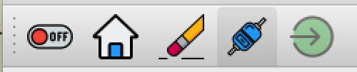
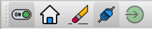
When you use checkable QAction items in a PyQt5 toolbar, Qt automatically draws a gray background behind the icon to indicate the selected (checked) state. This is part of the platform's default style and there's no straightforward property to turn it off. If your icons already visually communicate the on/off state — like a switch graphic — that gray box is redundant and looks messy.
The solution is to bypass QAction entirely for this use case and build a custom toggle button widget that renders SVG icons directly, with full control over how each state looks. No unwanted backgrounds, no platform style interference.
The approach: a custom ToggleButton based on QCheckBox
Instead of fighting with toolbar styling, you can create a widget that subclasses QCheckBox and implements its own paintEvent(). This gives you complete control over what gets drawn on screen. The widget accepts SVG files for each state and uses QSvgRenderer to paint the correct one.
This approach supports:
- Two-state mode (selected / not selected) — like a simple on/off toggle.
- Three-state (tristate) mode — adds a third visual state, useful for indeterminate or "no change" situations.
- A disabled state — with its own distinct icon.
Let's walk through how it works.
Setting up the ToggleButton class
The ToggleButton inherits from QCheckBox because checkboxes already have the concept of checked/unchecked states and tristate support built in. You override the painting to draw your own SVG icons instead of the default checkbox appearance.
Here are the state constants used to track which icon to display:
BUTTON_DISABLED = 0
BUTTON_SELECTED = 1
BUTTON_NOT_SELECTED = 2
BUTTON_NO_CHANGE = 3
The constructor accepts paths to SVG files for each state, along with sizing and tooltip information:
class ToggleButton(QCheckBox):
    def __init__(
            self,
            width=32,
            height=32,
            name=None,
            status_tip=None,
            selected=None,
            not_selected=None,
            no_change=None,
            disabled=None,
            tristate=False,
    ):
        super().__init__()

        self.setFixedSize(width, height)
        self.setCursor(Qt.PointingHandCursor)
        self.setTristate(tristate)
        self.setText(name)
        self.setStatusTip(status_tip)
Each SVG file path is stored in a dictionary keyed by state, so the paint method can look up the right file quickly:
PyQt/PySide Development Services — Stuck in development hell? I'll help you get your project focused, finished and released. Benefit from years of practical experience releasing software with Python.
        self.resource = {
            BUTTON_DISABLED: disabled,
            BUTTON_SELECTED: selected,
            BUTTON_NOT_SELECTED: not_selected,
            BUTTON_NO_CHANGE: no_change,
        }
Handling clicks and cycling through states
When the button is clicked, the state advances to the next one. In two-state mode, it alternates between selected and not selected. In tristate mode, it cycles through all three:
    def handle_clicked(self):
        self.state = 1 if self.state == self.max_states else self.state + 1
        self.repaint()
The max_states value is set to 3 for tristate or 2 for normal mode, so the cycling works correctly in both cases.
Custom painting with SVG
The heart of this widget is the paintEvent() override. Instead of letting Qt draw its default checkbox (or the gray-backgrounded action icon), you create a QPainter and use QSvgRenderer to draw the appropriate SVG file directly onto the widget:
    def paintEvent(self, *args, **kwargs):
        painter = QPainter(self)
        painter.setRenderHint(QPainter.Antialiasing)
        painter.setPen(Qt.NoPen)
        self.drawCustomWidget(painter)
        painter.end()

    def drawCustomWidget(self, painter):
        renderer = QSvgRenderer()
        resource = self.resource[self.state if not self.disabled else BUTTON_DISABLED]
        renderer.load(resource)
        renderer.render(painter)
Because you're drawing directly with QPainter, there's no default background, no selection highlight, and no platform style overrides. The SVG fills the widget area cleanly.
Disabling and enabling
The widget also supports a disabled state with its own icon. When disabled, the widget shows the disabled SVG and appends "[DISABLED]" to the status tip:
    def setDisabled(self, flag=True):
        self.disabled = flag
        super().setDisabled(flag)
        self.setStatusTip(f"{self.status_tip or ''} {'[DISABLED]' if flag else ''}")
Complete working example
Here's the full code. To run it, you'll need four SVG files for the different states. Replace the filenames in the MainWindow.__init__ with paths to your own SVG icons.
import sys
from pathlib import Path
from typing import Union
from PyQt5.QtCore import QPoint
from PyQt5.QtCore import Qt
from PyQt5.QtGui import QPainter
from PyQt5.QtSvg import QSvgRenderer
from PyQt5.QtWidgets import QApplication
from PyQt5.QtWidgets import QCheckBox
from PyQt5.QtWidgets import QFrame
from PyQt5.QtWidgets import QMainWindow
from PyQt5.QtWidgets import QPushButton
from PyQt5.QtWidgets import QVBoxLayout
BUTTON_DISABLED = 0
BUTTON_SELECTED = 1
BUTTON_NOT_SELECTED = 2
BUTTON_NO_CHANGE = 3
class ToggleButton(QCheckBox):
def __init__(
self,
width: int = 32,
height: int = 32,
name: str = None,
status_tip: str = None,
selected: Union[str, Path] = None,
not_selected: Union[str, Path] = None,
no_change: Union[str, Path] = None,
disabled: Union[str, Path] = None,
tristate: bool = False,
):
super().__init__()
self.setFixedSize(width, height)
self.setCursor(Qt.PointingHandCursor)
self.setTristate(tristate)
self.setText(name)
self.setStatusTip(status_tip)
self.status_tip = status_tip
self.max_states = 3 if tristate else 2
self.button_selected = selected
self.button_not_selected = not_selected
self.no_change = no_change
self.button_disabled = disabled
self.resource = {
BUTTON_DISABLED: self.button_disabled,
BUTTON_SELECTED: self.button_selected,
BUTTON_NOT_SELECTED: self.button_not_selected,
BUTTON_NO_CHANGE: self.no_change,
}
self.state = BUTTON_SELECTED
self.disabled = False
self.clicked.connect(self.handle_clicked)
def handle_clicked(self):
self.state = 1 if self.state == self.max_states else self.state + 1
self.repaint()
def setDisabled(self, flag: bool = True):
self.disabled = flag
super().setDisabled(flag)
self.setStatusTip(
f"{self.status_tip or ''} {'[DISABLED]' if flag else ''}"
)
def disable(self):
self.setDisabled(True)
def enable(self):
self.setDisabled(False)
def is_selected(self):
return self.state == BUTTON_SELECTED
def set_selected(self, on: bool = True):
self.state = BUTTON_SELECTED if on else BUTTON_NOT_SELECTED
self.repaint()
def hitButton(self, pos: QPoint):
return self.contentsRect().contains(pos)
def paintEvent(self, *args, **kwargs):
painter = QPainter(self)
painter.setRenderHint(QPainter.Antialiasing)
painter.setPen(Qt.NoPen)
self.drawCustomWidget(painter)
painter.end()
def drawCustomWidget(self, painter):
renderer = QSvgRenderer()
resource = self.resource[
self.state if not self.disabled else BUTTON_DISABLED
]
renderer.load(resource)
renderer.render(painter)
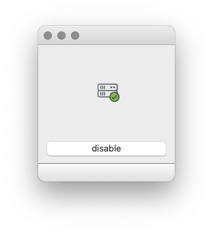
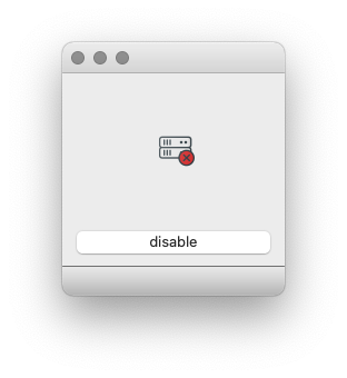
class MainWindow(QMainWindow):
def __init__(self):
super().__init__()
self.resize(200, 200)
self.container = QFrame()
self.container.setObjectName("Container")
self.layout = QVBoxLayout()
# Replace these with paths to your own SVG files
button_selected = "cs-connected.svg"
button_not_selected = "cs-not-connected.svg"
button_no_change = "cs-connected-alert.svg"
button_disabled = "cs-connected-disabled.svg"
self.toggle = ToggleButton(
name="CS-CONNECT",
status_tip="connect-disconnect hexapod control server",
selected=button_selected,
not_selected=button_not_selected,
no_change=button_no_change,
disabled=button_disabled,
tristate=True,
)
self.layout.addWidget(
self.toggle, Qt.AlignCenter, Qt.AlignCenter
)
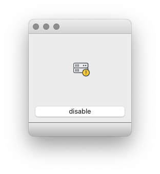
self.layout.addWidget(pb := QPushButton("disable"))
self.container.setLayout(self.layout)
self.setCentralWidget(self.container)
self.pb = pb
self.pb.setCheckable(True)
self.pb.clicked.connect(self.toggle_disable)
self.toggle.clicked.connect(self.toggle_clicked)
self.statusBar()
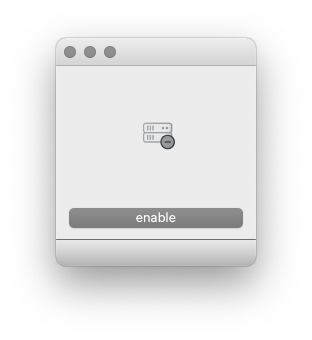
def toggle_disable(self, checked: bool):
if checked:
self.toggle.disable()
else:
self.toggle.enable()
self.pb.setText("enable" if checked else "disable")
def toggle_clicked(self, *args, **kwargs):
sender = self.sender()
print(f"clicked: {args=}, {kwargs=}")
print(f" {sender.state=}")
print(f" {sender.text()=}")
app = QApplication(sys.argv)
window = MainWindow()
window.show()
sys.exit(app.exec_())
Each click cycles through the states, and the disable button toggles the disabled appearance with its own dedicated icon.
Adapting this for your own project
To use the ToggleButton in a toolbar instead of a QAction, you can add it with QToolBar.addWidget():
toolbar = self.addToolBar("Main")
toolbar.addWidget(self.toggle)
This places your custom widget directly in the toolbar, giving you the same visual position as a QAction icon but with full control over rendering.
If you only need two states (the most common case), leave tristate=False and skip the no_change SVG — the button will alternate between selected and not_selected on each click.
This approach gives you clean, background-free toggle icons that look exactly the way you design them, regardless of platform or Qt style.
Create GUI Applications with Python & Qt6 by Martin Fitzpatrick — (PyQt6 Edition) The hands-on guide to making apps with Python — Save time and build better with this book. Over 15K copies sold.