In Qt, like in most GUI frameworks, widget is the name given to a component of the UI that the user can interact with. User interfaces are made up of multiple widgets, arranged within the window.
Qt comes with a large selection of widgets available and even allows you to create your own custom and customized widgets. In this PyQt5 widgets tutorial, you'll learn the basics of some of the most commonly used widgets for building Python GUI applications.
- A Quick PyQt5 Widgets Demo
- QLabel — Displaying Text and Images in PyQt5
- QCheckBox — Adding Checkable Options to Your PyQt5 App
- QComboBox — Drop-Down Selection Widget in PyQt5
- QListWidget — Scrollable List of Items
- QLineEdit — Single-Line Text Input Field
- QSpinBox and QDoubleSpinBox — Numeric Input Widgets
- QSlider — Slide-Bar Value Selection in PyQt5
- QDial — Rotatable Dial Widget
- Conclusion
You can download the source code for all our articles.
The code for this article is in the folder pyqt5/tutorials/basic-widgets
A Quick PyQt5 Widgets Demo
First, let's have a look at some of the most common PyQt5 widgets. The following code creates a range of PyQt widgets and adds them to a window layout so you can see them together:
import sys

from PyQt5.QtWidgets import (
    QApplication,
    QCheckBox,
    QComboBox,
    QDateEdit,
    QDateTimeEdit,
    QDial,
    QDoubleSpinBox,
    QFontComboBox,
    QLabel,
    QLCDNumber,
    QLineEdit,
    QMainWindow,
    QProgressBar,
    QPushButton,
    QRadioButton,
    QSlider,
    QSpinBox,
    QTimeEdit,
    QVBoxLayout,
    QWidget,
)

# Subclass QMainWindow to customize your application's main window
class MainWindow(QMainWindow):
    def __init__(self):
        super().__init__()

        self.setWindowTitle("Widgets App")

        layout = QVBoxLayout()
        widgets = [
            QCheckBox,
            QComboBox,
            QDateEdit,
            QDateTimeEdit,
            QDial,
            QDoubleSpinBox,
            QFontComboBox,
            QLCDNumber,
            QLabel,
            QLineEdit,
            QProgressBar,
            QPushButton,
            QRadioButton,
            QSlider,
            QSpinBox,
            QTimeEdit,
        ]

        for w in widgets:
            layout.addWidget(w())

        widget = QWidget()
        widget.setLayout(layout)

        # Set the central widget of the Window. Widget will expand
        # to take up all the space in the window by default.
        self.setCentralWidget(widget)

app = QApplication(sys.argv)
window = MainWindow()
window.show()
app.exec()
Run it! You'll see a window appear containing all the widgets we've created:
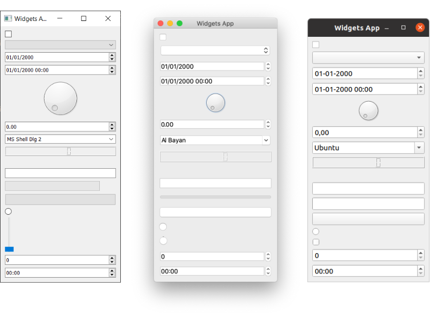 Big ol' list of PyQt5 widgets on Windows, Mac & Ubuntu Linux.
We'll cover how layouts work in Qt in the next tutorial.
Let's have a look at all the example PyQt5 widgets, from top to bottom:
| Widget | What it does |
|---|---|
QCheckbox |
A checkbox |
QComboBox |
A dropdown list box |
QDateEdit |
For editing dates and datetimes |
QDateTimeEdit |
For editing dates and datetimes |
QDial |
Rotatable dial |
QDoubleSpinbox |
A number spinner for floats |
QFontComboBox |
A list of fonts |
QLCDNumber |
A quite ugly LCD display |
QLabel |
Just a label, not interactive |
QLineEdit |
Enter a line of text |
QProgressBar |
A progress bar |
QPushButton |
A button |
QRadioButton |
A toggle set, with only one active item |
QSlider |
A slider |
QSpinBox |
An integer spinner |
QTimeEdit |
For editing times |
There are far more widgets than this, but they don't fit so well! You can see them all by checking the Qt documentation.
Next, we'll step through some of the most commonly used widgets and look at them in more detail. To experiment with the widgets, we'll need a simple application to put them in. Save the following code to a file named app.py and run it to make sure it's working:
Packaging Python Applications with PyInstaller by Martin Fitzpatrick — This step-by-step guide walks you through packaging your own Python applications from simple examples to complete installers and signed executables.
import sys

from PyQt5.QtCore import Qt
from PyQt5.QtGui import QPixmap
from PyQt5.QtWidgets import (
    QApplication,
    QCheckBox,
    QComboBox,
    QDoubleSpinBox,
    QLabel,
    QLineEdit,
    QListWidget,
    QMainWindow,
    QSlider,
    QSpinBox,
)

class MainWindow(QMainWindow):
    def __init__(self):
        super().__init__()

        self.setWindowTitle("My App")

app = QApplication(sys.argv)
window = MainWindow()
window.show()
app.exec()
In the code above, we've imported a number of Qt widgets. Now we'll step through each of those widgets in turn, adding them to our application and seeing how they behave.
QLabel — Displaying Text and Images in PyQt5
We'll start the tour with QLabel, arguably one of the simplest widgets available in the Qt toolbox. This is a simple one-line piece of text that you can position in your application. You can set the text by passing in a string as you create it:
widget = QLabel("Hello")
You can also set the text of a label dynamically, by using the setText() method:
widget = QLabel("1")  # The label is created with the text 1.
widget.setText("2")   # The label now shows 2.
You can also adjust font parameters, such as the size of the font or the alignment of text in the widget:
class MainWindow(QMainWindow):

    def __init__(self):
        super().__init__()

        self.setWindowTitle("My App")

        widget = QLabel("Hello")
        font = widget.font()
        font.setPointSize(30)
        widget.setFont(font)
        widget.setAlignment(Qt.AlignHCenter | Qt.AlignVCenter)

        self.setCentralWidget(widget)
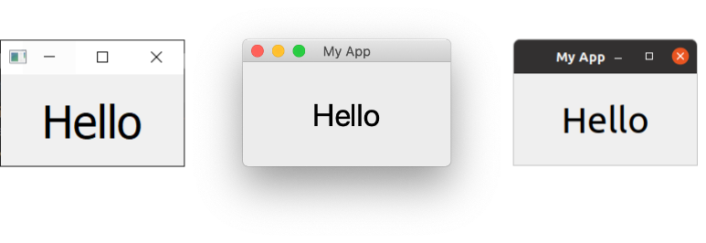 QLabel on Windows, Mac & Ubuntu Linux.
Font tip Note that if you want to change the properties of a widget font it is usually better to get the current font, update it, and then apply it back. This ensures the font face remains in keeping with the desktop conventions.
The alignment is specified by using a flag from the Qt namespace. The flags available for horizontal alignment are listed in the following table:
| Flag | Behavior |
|---|---|
Qt.AlignLeft |
Aligns with the left edge. |
Qt.AlignRight |
Aligns with the right edge. |
Qt.AlignHCenter |
Centers horizontally in the available space. |
Qt.AlignJustify |
Justifies the text in the available space. |
Similarly, the flags available for vertical alignment are:
| Flag | Behavior |
|---|---|
Qt.AlignTop |
Aligns with the top. |
Qt.AlignBottom |
Aligns with the bottom. |
Qt.AlignVCenter |
Centers vertically in the available space. |
You can combine flags together using pipes (|). However, note that you can only use vertical or horizontal alignment flags at a time:
align_top_left = Qt.AlignLeft | Qt.AlignTop
Note that you use an OR pipe (|) to combine the two flags (not A & B). This is because the flags are non-overlapping bitmasks. For example, Qt.AlignmentFlag.AlignLeft has the hexadecimal value 0x0001, while Qt.AlignmentFlag.AlignBottom is 0x0040. By ORing them together, we get the value 0x0041, representing 'bottom left'. This principle applies to all other combinatorial Qt flags. If this is gibberish to you, then feel free to ignore it and move on. Just remember to use the pipe (|) symbol.
Finally, there is also a shorthand flag that centers in both directions simultaneously:
| Flag | Behavior |
|---|---|
Qt.AlignCenter |
Centers horizontally and vertically. |
Displaying Images with QLabel and QPixmap
You can also use QLabel to display an image using setPixmap(). This accepts a pixmap, which you can create by passing an image filename to the QPixmap class.
Below is an image which you can download for this example.
 "Otje" the cat.
Place the file in the same folder as your code, and then display it in your window as follows:
widget.setPixmap(QPixmap('otje.jpg'))
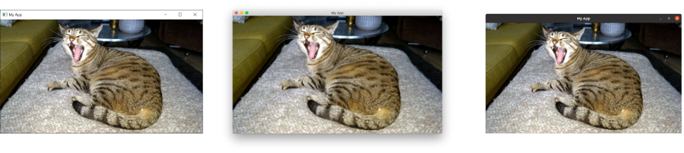 "Otje" the cat, displayed in a window.
What a lovely face. By default, the image scales while maintaining its aspect ratio. If you want it to stretch and scale to fit the window completely, then you can call setScaledContents(True) on the QLabel object:
widget.setScaledContents(True)
This way, your image will stretch and scale to fit the window completely.
QCheckBox — Adding Checkable Options to Your PyQt5 App
The next widget to look at is QCheckBox(), which, as the name suggests, presents a checkable box to the user. However, as with all Qt widgets, there are a number of configurable options to change the widget's default behaviors:
class MainWindow(QMainWindow):
    def __init__(self):
        super().__init__()

        self.setWindowTitle("My App")

        widget = QCheckBox("This is a checkbox")
        widget.setCheckState(Qt.Checked)

        # For tristate: widget.setCheckState(Qt.PartiallyChecked)
        # Or: widget.setTriState(True)
        widget.stateChanged.connect(self.show_state)

        self.setCentralWidget(widget)

    def show_state(self, s):
        print(s == Qt.Checked)
        print(s)
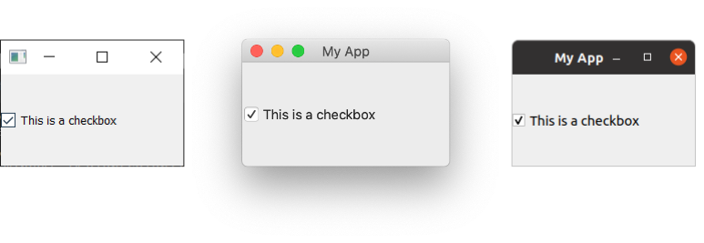 QCheckBox on Windows, Mac & Ubuntu Linux.
You can set a checkbox state programmatically using the setChecked() or setCheckState() methods. The former accepts either True or False, which correspond to the checked or unchecked states, respectively. However, with setCheckState(), you also specify a particular checked state using a Qt namespace flag:
| Flag | Behavior |
|---|---|
Qt.Unchecked |
Item is unchecked |
Qt.PartiallyChecked |
Item is partially checked |
Qt.Checked |
Item is checked |
A checkbox that supports a partially-checked (Qt.PartiallyChecked) state is commonly referred to as 'tri-state', which is being neither on nor off. A checkbox in this state is commonly shown as a greyed-out checkbox, and is commonly used in hierarchical checkbox arrangements where sub-items are linked to parent checkboxes.
If you set the value to Qt.PartiallyChecked the checkbox will become tristate. You can also set a checkbox to be tri-state without setting the current state to partially checked by using setTriState(True)
You may notice that when the script is running, the current state number is displayed as an int with checked = 2, unchecked = 0, and partially checked = 1. You don't need to remember these values, the Qt.Checked namespace variable == 2, for example. This is the value of these state's respective flags. This means you can test state using state == Qt.Checked.
QComboBox — Drop-Down Selection Widget in PyQt5
The QComboBox is a drop-down list, closed by default with an arrow to open it. You can select a single item from the list, with the currently selected item being shown as a label on the widget. The combo box is suited for the selection of a choice from a long list of options.
You have probably seen the combo box used for the selection of font face, or size, in word processing applications. Although Qt actually provides a specific font-selection combo box as QFontComboBox.
You can add items to a QComboBox by passing a list of strings to addItems(). Items will be added in the order they are provided:
class MainWindow(QMainWindow):
    def __init__(self):
        super().__init__()

        self.setWindowTitle("My App")

        widget = QComboBox()
        widget.addItems(["One", "Two", "Three"])

        # Sends the current index (position) of the selected item.
        widget.currentIndexChanged.connect( self.index_changed )

        # There is an alternate signal to send the text.
        widget.currentTextChanged.connect( self.text_changed )

        self.setCentralWidget(widget)

    def index_changed(self, i): # i is an int
        print(i)

    def text_changed(self, s): # s is a str
        print(s)
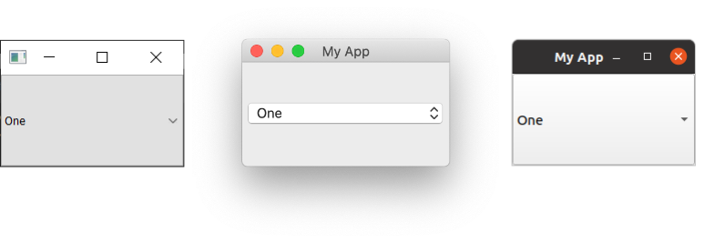 QComboBox on Windows, Mac & Ubuntu Linux.
The currentIndexChanged signal is triggered when the currently selected item is updated, by default passing the index of the selected item in the list. There is also a currentTextChanged signal, which instead provides the label of the currently selected item, which is often more useful.
QComboBox can also be editable, allowing users to enter values not currently in the list and either have them inserted or simply used as a value. To make the box editable, use the setEditable() method:
widget.setEditable(True)
You can also set a flag to determine how the insertion is handled. These flags are stored on the QComboBox class itself and are listed below:
| Flag | Behavior |
|---|---|
QComboBox.NoInsert |
Performs no insert. |
QComboBox.InsertAtTop |
Inserts as first item. |
QComboBox.InsertAtCurrent |
Replaces the currently selected item. |
QComboBox.InsertAtBottom |
Inserts after the last item. |
QComboBox.InsertAfterCurrent |
Inserts after the current item. |
QComboBox.InsertBeforeCurrent |
Inserts before the current item. |
QComboBox.InsertAlphabetically |
Inserts in alphabetical order. |
To use these, apply the flag as follows:
widget.setInsertPolicy(QComboBox.InsertAlphabetically)
You can also limit the number of items allowed in the box by using the setMaxCount() method:
widget.setMaxCount(10)
For a more in-depth look at the QComboBox, check out our QComboBox documentation.
QListWidget — Scrollable List of Items
This widget is similar to QComboBox, except options are presented as a scrollable list of items. It also supports the selection of multiple items at once. A QListWidget offers a currentItemChanged signal, which sends the QListWidgetItem (the element of the list widget), and a currentTextChanged signal, which sends the text of the current item:
class MainWindow(QMainWindow):
    def __init__(self):
        super().__init__()

        self.setWindowTitle("My App")

        widget = QListWidget()
        widget.addItems(["One", "Two", "Three"])

        widget.currentItemChanged.connect(self.index_changed)
        widget.currentTextChanged.connect(self.text_changed)

        self.setCentralWidget(widget)

    def index_changed(self, i): # Not an index, i is a QListWidgetItem
        print(i.text())

    def text_changed(self, s): # s is a str
        print(s)
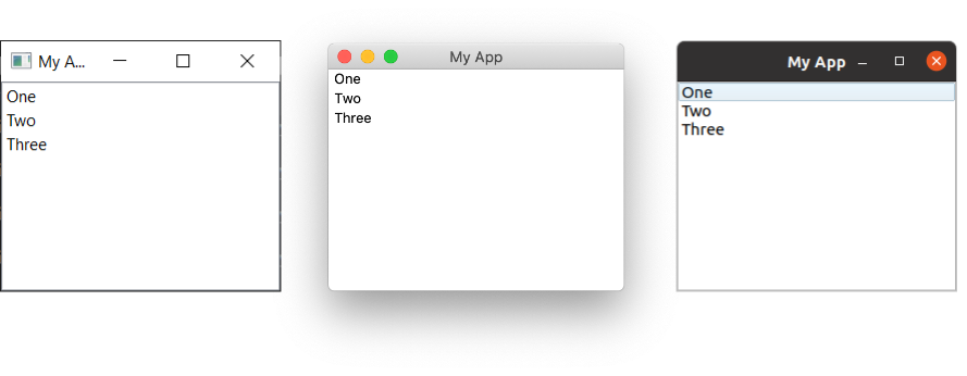 QListWidget on Windows, Mac & Ubuntu Linux.
QLineEdit — Single-Line Text Input Field
The QLineEdit widget is a single-line text editing box, into which users can type input. These are used for form fields, or settings where there is no restricted list of valid inputs. For example, when entering an email address, or computer name:
class MainWindow(QMainWindow):
    def __init__(self):
        super().__init__()

        self.setWindowTitle("My App")

        widget = QLineEdit()
        widget.setMaxLength(10)
        widget.setPlaceholderText("Enter your text")

        #widget.setReadOnly(True) # uncomment this to make it read-only

        widget.returnPressed.connect(self.return_pressed)
        widget.selectionChanged.connect(self.selection_changed)
        widget.textChanged.connect(self.text_changed)
        widget.textEdited.connect(self.text_edited)

        self.setCentralWidget(widget)

    def return_pressed(self):
        print("Return pressed!")
        self.centralWidget().setText("BOOM!")

    def selection_changed(self):
        print("Selection changed")
        print(self.centralWidget().selectedText())

    def text_changed(self, s):
        print("Text changed...")
        print(s)

    def text_edited(self, s):
        print("Text edited...")
        print(s)
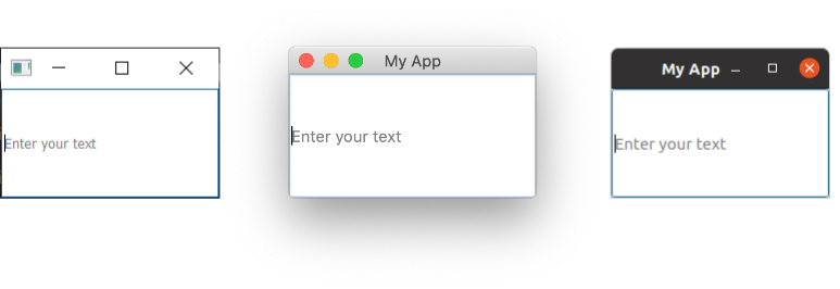 QLineEdit on Windows, Mac & Ubuntu Linux.
As demonstrated in the above code, you can set a maximum length for the text in a line edit using the setMaxLength() method.
The QLineEdit has a number of signals available for different editing events, including when the Enter key is pressed (by the user), and when the user selection is changed. There are also two edit signals, one for when the text in the box has been edited and one for when it has been changed. The distinction here is between user edits and programmatic changes. The textEdited signal is only sent when the user edits text.
Additionally, it is possible to perform input validation using an input mask to define which characters are supported and where. This can be applied to the field as follows:
widget.setInputMask('000.000.000.000;_')
The above would allow a series of 3-digit numbers separated with periods, and could therefore be used to validate IPv4 addresses.
QSpinBox and QDoubleSpinBox — Numeric Input Widgets
QSpinBox provides a small numerical input box with arrows to increase and decrease the value. QSpinBox supports integers, while the related widget, QDoubleSpinBox, supports floats:
class MainWindow(QMainWindow):
    def __init__(self):
        super().__init__()

        self.setWindowTitle("My App")

        widget = QSpinBox()
        # Or: widget = QDoubleSpinBox()

        widget.setMinimum(-10)
        widget.setMaximum(3)
        # Or: widget.setRange(-10,3)

        widget.setPrefix("$")
        widget.setSuffix("c")
        widget.setSingleStep(3)  # Or e.g. 0.5 for QDoubleSpinBox
        widget.valueChanged.connect(self.value_changed)
        widget.textChanged.connect(self.value_changed_str)

        self.setCentralWidget(widget)

    def value_changed(self, i):
        print(i)

    def value_changed_str(self, s):
        print(s)
Run it, and you'll see a numeric entry box. The value shows pre and post-fix units and is limited to the range 3 to -10.
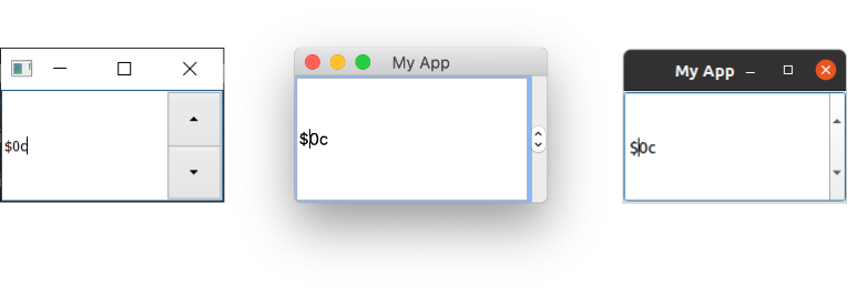 QSpinBox on Windows, Mac & Ubuntu Linux.
The demonstration code above shows the various features that are available for the widget.
To set the range of acceptable values, you can use the setMinimum() and setMaximum() methods. Alternatively, use setRange() to set both simultaneously. Annotation of value types is supported with both prefixes and suffixes that can be added to the number (e.g. for currency markers or units) using the setPrefix() and setSuffix() methods, respectively.
Clicking the up and down arrows on the widget will increase or decrease the value in the widget by an amount, which can be set using the setSingleStep() method. Note that this has no effect on the values that are acceptable to the widget.
Both QSpinBox and QDoubleSpinBox have a valueChanged signal, which fires whenever their value is altered. The raw valueChanged signal sends the numeric value (either an int or a float), while textChanged sends the value as a string, including both the prefix and suffix characters.
You can optionally disable text input on the spin box's line edit, by setting it to read-only. With this setting, the value can only be changed using the controls:
widget.lineEdit().setReadOnly(True)
This setting also has the side effect of disabling the flashing cursor.
QSlider — Slide-Bar Value Selection in PyQt5
QSlider provides a slide-bar widget, which internally works like a QDoubleSpinBox. Rather than display the current value numerically, that value is represented by the position of the slider's handle along the length of the widget. This is often useful when providing adjustment between two extremes, but when absolute accuracy is not required. The most common use case of this type of widget is for volume controls in audio playback.
There is an additional sliderMoved signal that is triggered whenever the slider moves position and a sliderPressed signal that is emitted whenever the slider is clicked:
class MainWindow(QMainWindow):
    def __init__(self):
        super().__init__()

        self.setWindowTitle("My App")

        widget = QSlider()

        widget.setMinimum(-10)
        widget.setMaximum(3)
        # Or: widget.setRange(-10,3)

        widget.setSingleStep(3)

        widget.valueChanged.connect(self.value_changed)
        widget.sliderMoved.connect(self.slider_position)
        widget.sliderPressed.connect(self.slider_pressed)
        widget.sliderReleased.connect(self.slider_released)

        self.setCentralWidget(widget)

    def value_changed(self, i):
        print(i)

    def slider_position(self, p):
        print("position", p)

    def slider_pressed(self):
        print("Pressed!")

    def slider_released(self):
        print("Released")
Run this, and you'll see a slider widget. Drag the slider to change the value:
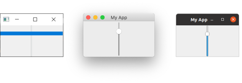 QSlider on Windows, Mac & Ubuntu Linux.
The singleStep property of a QSlider only affects keyboard navigation when using arrow keys. When we interact with the slider using the mouse, the singleStep is ignored, and the slider can be moved freely.
You can also construct a slider with a vertical or horizontal orientation by providing the orientation as you create it. The orientation flags are defined in the Qt namespace:
widget = QSlider(Qt.Vertical)
# Or:
widget = QSlider(Qt.Horizontal)
QDial — Rotatable Dial Widget
Finally, the QDial widget is a rotatable widget that works just like the slider but appears as an analog dial. This widget looks nice, but from a UI perspective, it is not particularly user-friendly. However, dials are often used in audio applications as a representation of real-world analog dials:
class MainWindow(QMainWindow):
    def __init__(self):
        super().__init__()

        self.setWindowTitle("My App")

        widget = QDial()
        widget.setRange(-10, 100)
        widget.setSingleStep(0.5)

        widget.valueChanged.connect(self.value_changed)
        widget.sliderMoved.connect(self.slider_position)
        widget.sliderPressed.connect(self.slider_pressed)
        widget.sliderReleased.connect(self.slider_released)

        self.setCentralWidget(widget)

    def value_changed(self, i):
        print(i)

    def slider_position(self, p):
        print("position", p)

    def slider_pressed(self):
        print("Pressed!")

    def slider_released(self):
        print("Released")
Run this, and you'll see a circular dial. Rotate it to select a number from the range:
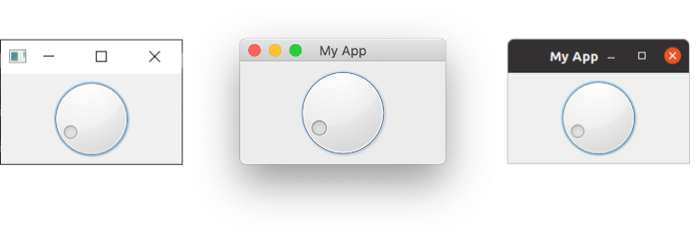 QDial on Windows, Mac & Ubuntu Linux.
The signals are the same as for the QSlider widget and retain the same names (e.g. sliderMoved).
Conclusion
This concludes our brief tour of the most common PyQt5 widgets used in Python GUI applications. You've learned how to use QLabel, QCheckBox, QComboBox, QListWidget, QLineEdit, QSpinBox, QDoubleSpinBox, QSlider, and QDial to build interactive user interfaces. Each of these widgets provides signals and configurable properties that make them flexible enough for a wide range of applications.
To see the full list of available PyQt5 widgets, including all their signals and attributes, check out the Qt documentation.