One of the major strengths of Python in is exploratory data science and visualization, using tools such as pandas, NumPy, scikit-learn for data analysis and matplotlib for plotting. Building GUI applications with PySide gives us access to all these Python tools directly from within our app, allowing us to build complex data-driven apps and interactive dashboards.
While it is possible to embed matplotlib plots in PySide, the experience does not feel entirely native. For simple and highly interactive plots you may want to consider using PyQtGraph instead. PyQtGraph is built on top of Qt's native QGraphicsScene, giving better drawing performance (particularly for live data), as well as providing interactivity and the ability to easily customize plots with Qt graphics widgets.
In this tutorial we'll walk through the first steps of creating a plot widget with PyQtGraph and then demonstrate plot customization using line colors, line type, axis labels, background color and plotting multiple lines.
Getting Started
To be able to use PyQtGraph with PySide you first need to install the package to your Python environment. You can do this as normal using pip.
pip install pyqtgraph
Once the installation is complete you should be able to import the module as normal.
Creating a PyQtGraph Widget
In PyQtGraph, all plots are created using the PlotWidget widget. This widget provides a contained canvas on which plots of any type can be added and configured. Under the hood, this plot widget uses Qt's native QGraphicsScene, meaning it is fast and efficient yet simple to integrate with the rest of our app. You can create a PlotWidget as for any other widget.
The basic template app, with a single PlotWidget in a QMainWindow is shown below.
In the following examples we'll create the PyQtGraph widget in code. Want to know how to embed PyQtGraph when using Qt Designer? See Embedding custom widgets from Qt Designer
import sys

import pyqtgraph as pg
from PySide2.QtWidgets import QApplication, QMainWindow

class MainWindow(QMainWindow):
    def __init__(self):
        super().__init__()

        self.plot_graph = pg.PlotWidget()
        self.setCentralWidget(self.plot_graph)

        hour = [1, 2, 3, 4, 5, 6, 7, 8, 9, 10]
        temperature = [30, 32, 34, 32, 33, 31, 29, 32, 35, 45]

        # plot data: x, y values
        self.plot_graph.plot(hour, temperature)

app = QApplication(sys.argv)
w = MainWindow()
w.show()
app.exec_()
In all our examples below we import PyQtGraph using import pyqtgraph as pg. This is a common convention in PyQtGraph examples to keep things tidy and reduce typing. You can import and use it as import pyqtgraph if you prefer.
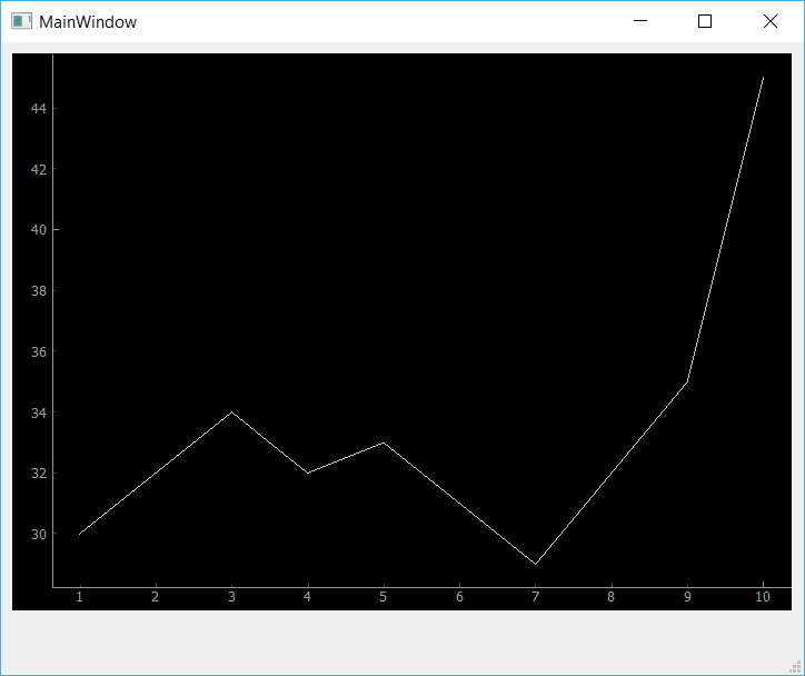 The custom PyQtGraph widget showing dummy data.
The default plot style of PyQtGraph is quite bare — a black background with a thin (barely visible) white line. In the next section we'll look at what options we have available to us in PyQtGraph to improve the appearance and usability of our plots.
Styling Plots
PyQtGraph uses Qt's QGraphicsScene to render the graphs. This gives us access to all the standard Qt line and shape styling options for use in plots. However, PyQtGraph provides an API for using these to draw plots and manage the plot canvas.
Below we'll go through the most common styling features you'll need to create and customize your own plots.
Background Color
Beginning with the app skeleton above, we can change the background color by calling .setBackground() on our PlotWidget instance (in self.plot_graph). The code below will set the background to white, by passing in the string 'w'.
self.plot_graph.setBackground('w')
You can set (and update) the background color of the plot at any time.
import sys

import pyqtgraph as pg
from PySide2.QtWidgets import QMainWindow, QApplication

class MainWindow(QMainWindow):
    def __init__(self):
        super().__init__()

        self.plot_graph = pg.PlotWidget()
        self.setCentralWidget(self.plot_graph)

        hour = [1, 2, 3, 4, 5, 6, 7, 8, 9, 10]
        temperature = [30, 32, 34, 32, 33, 31, 29, 32, 35, 45]

        self.plot_graph.setBackground('w')
        self.plot_graph.plot(hour, temperature)

app = QApplication(sys.argv)
main = MainWindow()
main.show()
app.exec_()
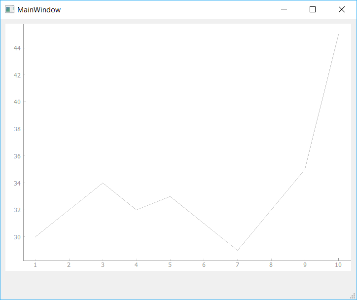 Change PyQtGraph Plot Background to White
There are a number of simple colors available using single letters, based on the standard colors used in matplotlib. They're pretty unsurprising — "r" is red, "b" is blue — except that "k" is used for black. In addition to these single-letter codes, you can also set more complex colors using hex notation, e.g. #672922 as a string.
self.plot_graph.setBackground('#bbccaa') # hex
RGB and RGBA values can be passed in as a 3-tuple or 4-tuple respectively, using values 0-255.
self.plot_graph.setBackground((100,50,255))      # RGB each 0-255
self.plot_graph.setBackground((100,50,255,25))   # RGBA (A = alpha opacity)
Lastly, you can also specify colors using Qt's QColor type directly.
from PySide2 import QtGui  # Place this at the top of your file.
self.plot_graph.setBackground(QtGui.QColor(100, 50, 254, 25))
This can be useful if you're using specific QColor objects elsewhere in your application, or to set your plot background to the default GUI background color.
color = self.palette().color(QtGui.QPalette.Window)  # Get the default window background
self.plot_graph.setBackground(color)
Line Color, Width & Style
Lines in PyQtGraph are drawn using standard Qt QPen types. This gives you the same full control over line drawing as you would have in any other QGraphicsScene drawing. To use a pen to plot a line, we create a new QPen instance and pass it into the plot() method.
Below we create a QPen object, passing in a 3-tuple of int values specifying an RGB value (of full red). We could also define this by passing 'r', or a QColor object. Then we pass this into plot with the pen parameter.
pen = pg.mkPen(color=(255, 0, 0))
self.plot_graph.plot(hour, temperature, pen=pen)
The complete code is shown below.
import sys

import pyqtgraph as pg
from PySide2.QtWidgets import QApplication, QMainWindow

class MainWindow(QMainWindow):
    def __init__(self):
        super().__init__()

        self.plot_graph = pg.PlotWidget()
        self.setCentralWidget(self.plot_graph)

        hour = [1, 2, 3, 4, 5, 6, 7, 8, 9, 10]
        temperature = [30, 32, 34, 32, 33, 31, 29, 32, 35, 45]

        self.plot_graph.setBackground('w')

        pen = pg.mkPen(color=(255, 0, 0))
        self.plot_graph.plot(hour, temperature, pen=pen)

app = QApplication(sys.argv)
main = MainWindow()
main.show()
app.exec_()
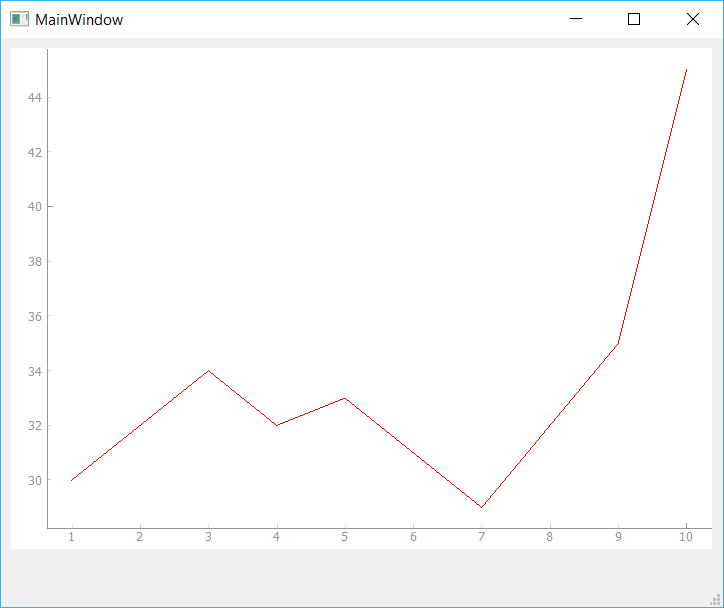 Changing Line Color
By changing the QPen object, we can change the appearance of the line, including both line width in pixels and style (dashed, dotted, etc.) using standard Qt line styles. For example, the following line of code creates a 15px width dashed line in red.
pen = pg.mkPen(color=(255, 0, 0), width=15, style=QtCore.Qt.DashLine)
The result is shown below, giving a 15px dashed red line.
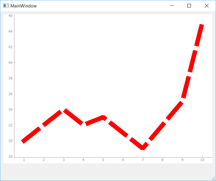 Changing Line Width and Style
The standard Qt line styles can all be used, including Qt.SolidLine, Qt.DashLine, Qt.DotLine, Qt.DashDotLine and Qt.DashDotDotLine. Examples of each of these lines are shown in the image below, and you can read more in the Qt Documentation.
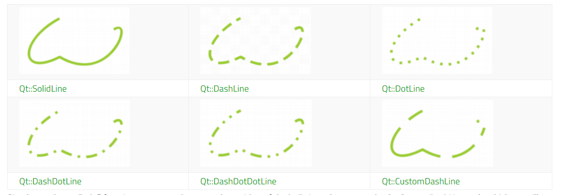 Qt Line Types
Line Markers
For many plots it can be helpful to place markers in addition or instead of lines on the plot. To draw a marker on the plot, pass the symbol to use as a marker when calling .plot as shown below.
self.plot_graph.plot(hour, temperature, symbol='+')
In addition to symbol you can also pass in symbolSize, symbolBrush and symbolPen parameters. The value passed as symbolBrush can be any color, or QBrush type, while symbolPen can be passed any color or a QPen instance. The pen is used to draw the outline of the shape, while brush is used for the fill.
For example, the code below will give a blue cross marker of size 30 on a thick red dashed line.
pen = pg.mkPen(
    color=(255, 0, 0),
    width=15,
    style=QtCore.Qt.DashLine
)
self.plot_graph.plot(
    hour,
    temperature,
    pen=pen,
    symbol='+',
    symbolSize=30,
    symbolBrush='b'
)
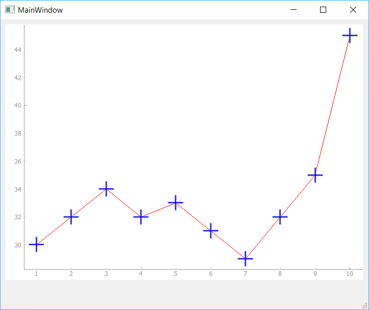 Adding Symbols on Line
In addition to the + plot marker, PyQtGraph supports the following standard markers shown in the table below. These can all be used in the same way.
| Character | Marker Shape |
|---|---|
"o" |
Circle |
"s" |
Square |
"t" |
Triangle |
"d" |
Diamond |
"+" |
Plus |
"t1" |
Triangle pointing upwards |
"t2" |
Triangle pointing right side |
"t3" |
Triangle pointing left side |
"p" |
Pentagon |
"h" |
Hexagon |
"star" |
Star |
"x" |
Cross |
"arrow_up" |
Arrow Up |
"arrow_right" |
Arrow Right |
"arrow_down" |
Arrow Down |
"arrow_left" |
Arrow Left |
"crosshair" |
Crosshair |
You can use any of these symbols as markers for your data points. If you have more specific marker requirements, then you can also use a QPainterPath object, which allows you to draw completely custom marker shapes.
Plot Titles
Chart titles are important to provide context to what is shown on a given chart. In PyQtGraph you can add a main plot title using the setTitle() method on the PlotWidget, passing in your title string.
self.plot_graph.setTitle("Your Title Here")
You can apply text styles, including colors, font sizes and weights to your titles (and any other labels in PyQtGraph) by passing additional arguments. The available style arguments are shown below.
The code below sets the color to blue with a font size of 30px.
self.plot_graph.setTitle("Your Title Here", color="b", size="30pt")
You can also style your headers with HTML tag syntax if you prefer, although it's less readable.
self.plot_graph.setTitle("<span style=\"color:blue;font-size:30pt\">Your Title Here</span>")
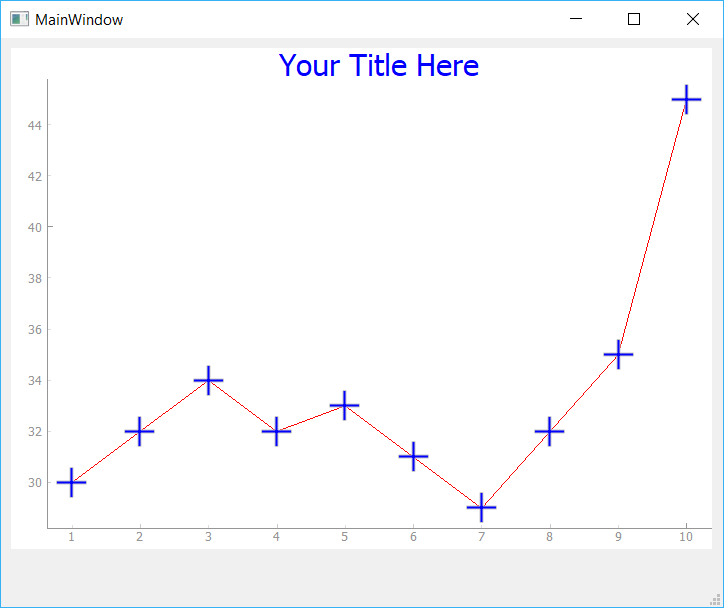 Adding Chart Title
Axis Labels
Similar to titles, we can use the setLabel() method to create our axis titles. This requires two parameters, position and text. The position can be any one of 'left', 'right', 'top', 'bottom', which describe the position of the axis on which the text is placed. The 2nd parameter text is the text you want to use for the label.
You can pass additional style parameters into the method. These differ slightly from the title, in that they need to be valid CSS name-value pairs. For example, the size is now font-size. Because the name font-size has a hyphen in it, you cannot pass it directly as a keyword argument, but must use ** to unpack a dictionary.
styles = {'color':'r', 'font-size':'20px'}
self.plot_graph.setLabel('left', 'Temperature (°C)', **styles)
self.plot_graph.setLabel('bottom', 'Hour (H)', **styles)
These also support HTML syntax for styling if you prefer.
self.plot_graph.setLabel('left', "<span style=\"color:red;font-size:20px\">Temperature (°C)</span>")
self.plot_graph.setLabel('bottom', "<span style=\"color:red;font-size:20px\">Hour (H)</span>")
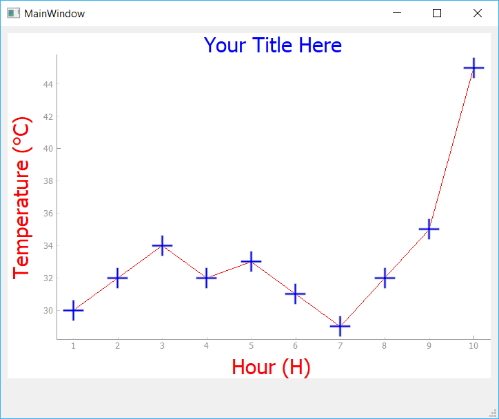 Add Axis Labels
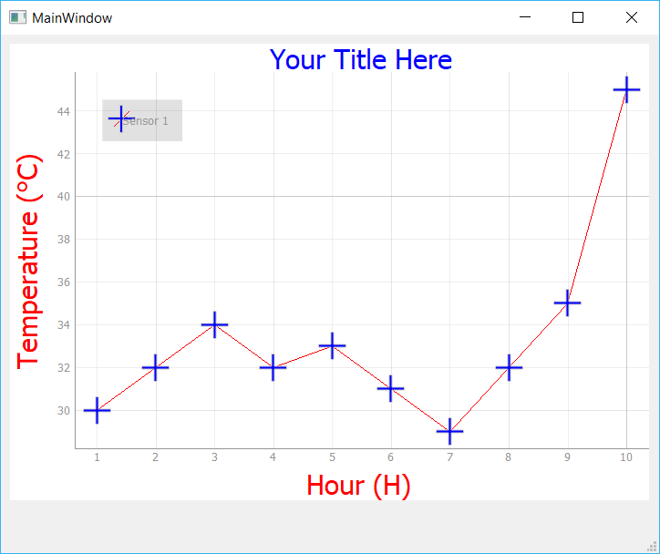
Legends
In addition to the axis and plot titles you will often want to show a legend identifying what a given line represents. This is particularly important when you start adding multiple lines to a plot. Adding a legend to a plot can be accomplished by calling .addLegend() on the PlotWidget. However, before this will work we need to provide a name for each line when calling .plot().
The example below assigns a name "Sensor 1" to the line we are plotting with .plot(). This name will be used to identify the line in the legend.
pen = pg.mkPen(color='r')
self.plot_graph.plot(hour, temperature, name="Sensor 1", pen=pen, symbol='+', symbolSize=30, symbolBrush='b')
self.plot_graph.addLegend()
 Add Legend
The legend appears in the top left by default. If we would like to move it, we can drag and drop the legend elsewhere. We can also specify a default offset by passing a 2-tuple to the offset parameter when creating the legend.
Background Grid
Adding a background grid can make your plots easier to read, particularly when trying to compare relative x & y values against each other. You can turn on a background grid for your plot by calling .showGrid on your PlotWidget. You can toggle x and y grids independently.
The following line will create the grid for both the X and Y axes.
self.plot_graph.showGrid(x=True, y=True)
 Add Grid
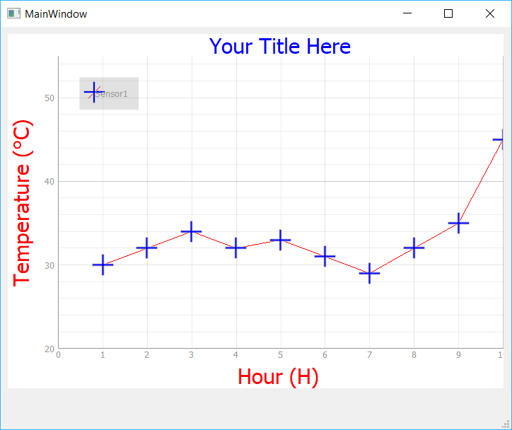
Setting Axis Limits
Sometimes it can be useful to restrict the range of data which is visible on the plot, or to lock the axis to a consistent range regardless of the data input (e.g. a known min-max range). In PyQtGraph this can be done using the .setXRange() and .setYRange() methods. These force the plot to only show data within the specified ranges on each axis.
Below we set two ranges, one on each axis. The 1st argument is the minimum value and the 2nd is the maximum.
self.plot_graph.setXRange(5, 20)
self.plot_graph.setYRange(30, 40)
An optional padding argument causes the range to be set larger than specified by the given fraction (this is between 0.02 and 0.1 by default, depending on the size of the ViewBox). If you want to remove this padding entirely, pass 0.
self.plot_graph.setXRange(5, 20, padding=0)
self.plot_graph.setYRange(30, 40, padding=0)
The complete code so far is shown below:
import sys

import pyqtgraph as pg
from PySide2.QtWidgets import QApplication, QMainWindow

class MainWindow(QMainWindow):
    def __init__(self):
        super().__init__()

        self.plot_graph = pg.PlotWidget()
        self.setCentralWidget(self.plot_graph)

        hour = [1, 2, 3, 4, 5, 6, 7, 8, 9, 10]
        temperature = [30, 32, 34, 32, 33, 31, 29, 32, 35, 45]

        # Set background color to white
        self.plot_graph.setBackground('w')
        # Set title
        self.plot_graph.setTitle("Your Title Here", color="b", size="30pt")
        # Set axis labels
        styles = {"color": "#f00", "font-size": "20px"}
        self.plot_graph.setLabel("left", "Temperature (°C)", **styles)
        self.plot_graph.setLabel("bottom", "Hour (H)", **styles)
        # Add legend
        self.plot_graph.addLegend()
        # Show the grid
        self.plot_graph.showGrid(x=True, y=True)
        # Set range
        self.plot_graph.setXRange(0, 10, padding=0)
        self.plot_graph.setYRange(20, 55, padding=0)

        pen = pg.mkPen(color=(255, 0, 0))
        self.plot_graph.plot(hour, temperature, name="Sensor 1", pen=pen, symbol='+', symbolSize=30, symbolBrush='b')

app = QApplication(sys.argv)
main = MainWindow()
main.show()
app.exec_()
 Set Axis Range
Plotting Multiple Mines
It is common for plots to involve more than one line. In PyQtGraph this is as simple as calling .plot() multiple times on the same PlotWidget. In the following example we're going to plot two lines of similar data, using the same line styles, thicknesses etc. for each, but changing the line color.
To simplify this we can create our own custom plot method on our MainWindow. This accepts x and y parameters to plot, the name of the line (for the legend) and a color. We use the color for both the line and marker color.
    def plot(self, x, y, plotname, color):
        pen = pg.mkPen(color=color)
        self.plot_graph.plot(
            x, y, name=plotname, pen=pen, symbol='+', symbolSize=30, symbolBrush=(color)
        )
To plot separate lines we'll create a new array called temperature_2 and populate it with random numbers similar to temperature (now temperature_1). Plotting these alongside each other allows us to compare them together.
Now we can call the plot() method twice, and this will generate two lines on the plot.
self.plot(hour, temperature_1, "Sensor1", 'r')
self.plot(hour, temperature_2, "Sensor2", 'b')
Here's the code:
import sys

import pyqtgraph as pg
from PySide2.QtWidgets import QApplication, QMainWindow

class MainWindow(QMainWindow):
    def __init__(self):
        super().__init__()

        self.plot_graph = pg.PlotWidget()
        self.setCentralWidget(self.plot_graph)

        hour = [1, 2, 3, 4, 5, 6, 7, 8, 9, 10]
        temperature_1 = [30, 32, 34, 32, 33, 31, 29, 32, 35, 45]
        temperature_2 = [50,35,44,22,38,32,27,38,32,44]

        #Add Background color to white
        self.plot_graph.setBackground('w')
        # Add Title
        self.plot_graph.setTitle("Your Title Here", color="b", size="30pt")
        # Add Axis Labels
        styles = {"color": "#f00", "font-size": "20px"}
        self.plot_graph.setLabel("left", "Temperature (°C)", **styles)
        self.plot_graph.setLabel("bottom", "Hour (H)", **styles)
        #Add legend
        self.plot_graph.addLegend()
        #Add grid
        self.plot_graph.showGrid(x=True, y=True)
        #Set Range
        self.plot_graph.setXRange(0, 10, padding=0)
        self.plot_graph.setYRange(20, 55, padding=0)

        self.plot(hour, temperature_1, "Sensor1", 'r')
        self.plot(hour, temperature_2, "Sensor2", 'b')

    def plot(self, x, y, plotname, color):
        pen = pg.mkPen(color=color)
        self.plot_graph.plot(x, y, name=plotname, pen=pen, symbol='+', symbolSize=30, symbolBrush=(color))

app = QApplication(sys.argv)
main = MainWindow()
main.show()
app.exec_()
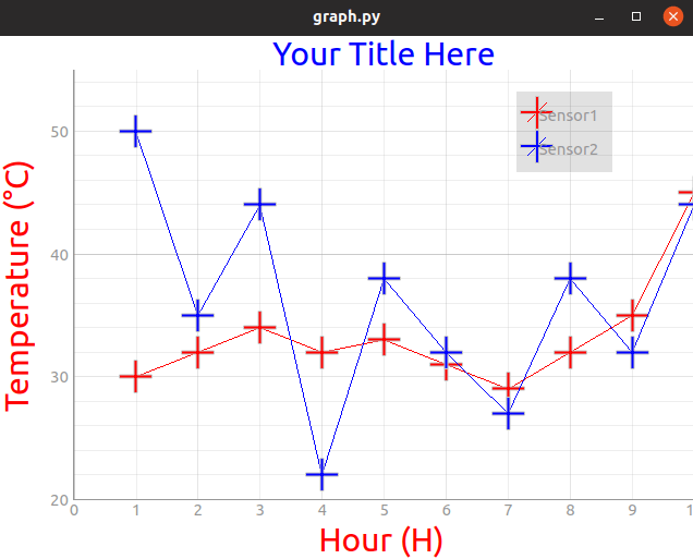 2 Line Graph
Play around with this function, customizing your markers, line widths, colors and other parameters.
Clearing the plot
Finally, sometimes we might want to clear and refresh the plot periodically. We can easily do that by calling .clear().
self.plot_graph.clear()
This will remove the lines from the plot but keep all other attributes the same.
Updating the plot
While you can simply clear the plot and redraw all your elements again, this means Qt has to destroy and recreate all your QGraphicsScene objects. For small or simple plots this is probably not noticeable, but if we want to create high-performance streaming plots, it is much better to update the data in place. PyQtGraph takes the new data and updates the plotted line to match without affecting any other elements in the plot.
To update a line we need a reference to the line object. This reference is returned when first creating the line using .plot and we can simply store this in a variable. Note that this is a reference to the line not to the plot.
my_line_ref = self.plot_graph.plot(x, y)
Once we have the reference, updating the plot is simply a case of calling .setData on the reference to apply the new data. In the example below we've taken our simple plot demo and expanded it to take a reference to the line.
import sys
from random import randint

import pyqtgraph as pg
from PySide2.QtWidgets import QApplication, QMainWindow
from PySide2.QtCore import QTimer

class MainWindow(QMainWindow):
    def __init__(self):
        super().__init__()

        self.plot_graph = pg.PlotWidget()
        self.setCentralWidget(self.plot_graph)

        self.x = list(range(100))  # 100 time points
        self.y = [randint(0, 100) for _ in range(100)]  # 100 data points

        self.plot_graph.setBackground('w')

        pen = pg.mkPen(color=(255, 0, 0))
        self.data_line = self.plot_graph.plot(self.x, self.y, pen=pen)

app = QApplication(sys.argv)
w = MainWindow()
w.show()
app.exec_()
We're going to update our data every 50 ms. Although PyQtGraph can plot data much more quickly than this, it can get hard to watch! To do this we define a Qt timer and set it to call a custom method, update_plot_data, where we'll change the data. We define this timer in the __init__ block so it is automatically started. Add the following to the window class:
        # ... init continued ...
        self.timer = QTimer()
        self.timer.setInterval(50)
        self.timer.timeout.connect(self.update_plot_data)
        self.timer.start()

    def update_plot_data(self):

        self.x = self.x[1:]  # Remove the first x element.
        self.x.append(self.x[-1] + 1)  # Add a new value 1 higher than the last.

        self.y = self.y[1:]  # Remove the first y element.
        self.y.append( randint(0,100))  # Add a new random value.

        self.data_line.setData(self.x, self.y)  # Update the data.
If you run the app you will see a plot with random data scrolling rapidly to the left, with the X values also updating and scrolling in time, as if streaming data. We can replace the random data with our own real data, taken e.g. from a live sensor readout or an API. PyQtGraph is performant enough to support multiple simultaneous plots using this method.
The complete code is shown below.
import sys
from random import randint

import pyqtgraph as pg
from PySide2.QtWidgets import QApplication, QMainWindow
from PySide2.QtCore import QTimer

class MainWindow(QMainWindow):
    def __init__(self):
        super().__init__()

        self.plot_graph = pg.PlotWidget()
        self.setCentralWidget(self.plot_graph)

        self.x = list(range(100))  # 100 time points
        self.y = [randint(0,100) for _ in range(100)]  # 100 data points

        self.plot_graph.setBackground('w')

        pen = pg.mkPen(color=(255, 0, 0))
        self.data_line =  self.plot_graph.plot(self.x, self.y, pen=pen)

        self.timer = QTimer()
        self.timer.setInterval(50)
        self.timer.timeout.connect(self.update_plot_data)
        self.timer.start()

    def update_plot_data(self):

        self.x = self.x[1:]  # Remove the first y element.
        self.x.append(self.x[-1] + 1)  # Add a new value 1 higher than the last.

        self.y = self.y[1:]  # Remove the first
        self.y.append( randint(0,100))  # Add a new random value.

        self.data_line.setData(self.x, self.y)  # Update the data.

app = QApplication(sys.argv)
main = MainWindow()
main.show()
app.exec_()
Conclusion
In this tutorial we've discovered how to draw simple plots with PyQtGraph and customize lines, markers and labels. For a complete overview of PyQtGraph methods and capabilities see the PyQtGraph Documentation & API Reference. The PyQtGraph repository on Github also has complete set of more complex example plots in Plotting.py (shown below).
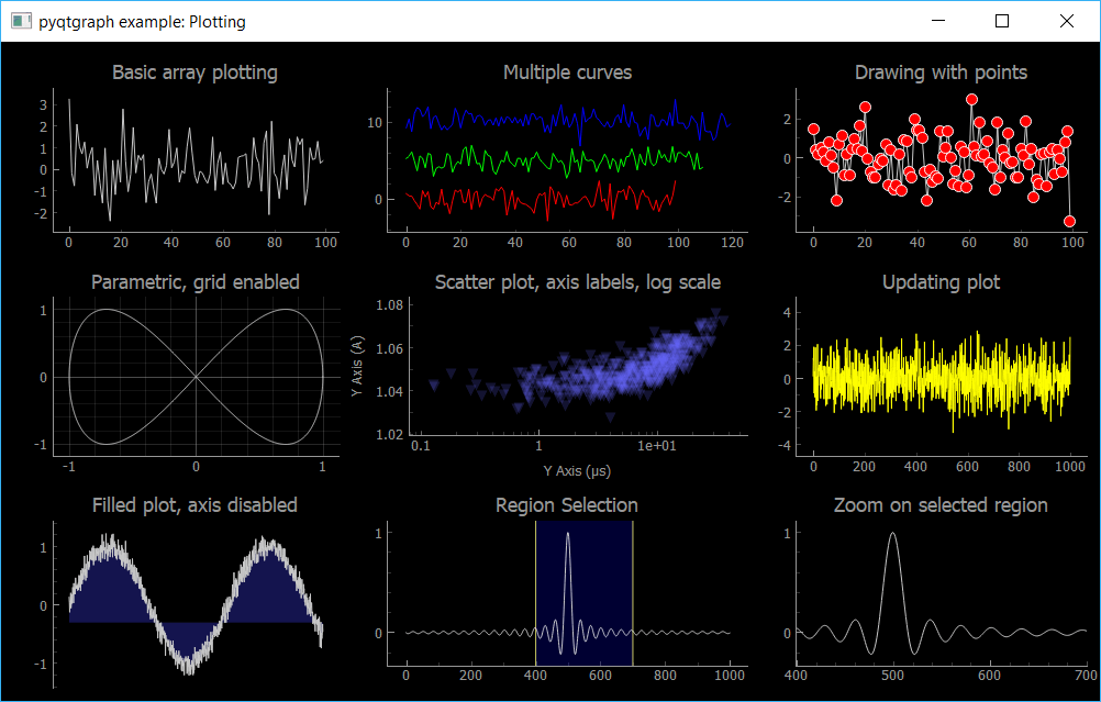 PyQtGraph Repo Example (Plotting.py)

Create GUI Applications with Python & Qt6 by Martin Fitzpatrick
(PySide6 Edition) The hands-on guide to making apps with Python — Over 15,000 copies sold!
