How do I replace the numeric tick labels on a PyQtGraph axis with custom strings, like month names or category labels?
When you're plotting data in PyQtGraph, the axes default to showing numeric tick values. That's fine for a lot of use cases, but sometimes your x-axis represents something more meaningful — like months of the year, days of the week, or category names. In those situations, you want to replace those numbers with readable string labels.
In this tutorial, you'll learn how to customize the tick labels on a PyQtGraph axis so they display strings instead of numbers.
How axis ticks work in PyQtGraph
PyQtGraph plots data using numeric values on both axes. When your x-axis data represents categories — like months — you typically use integers (1, 2, 3, ...) as placeholders and then map those integers to human-readable labels.
To do this, you need to:
- Create a list of 2-tuples, where each tuple pairs a numeric tick position with a string label.
- Get the axis object from the plot widget.
- Call
.setTicks()on that axis, passing your labels wrapped in a list.
Let's walk through a complete example.
Setting up the plot
We'll create a simple line plot showing temperature values across 10 months. The x-axis will use integers from 1 to 10 to represent months, and we'll replace those numbers with actual month names.
First, we generate the tick labels using Python's datetime module:
import datetime

months = [1, 2, 3, 4, 5, 6, 7, 8, 9, 10]

month_labels = [
    (m, datetime.date(2020, m, 1).strftime("%B"))
    for m in months
]
This gives us a list like:
[(1, "January"), (2, "February"), (3, "March"), ...]
Each tuple maps a position on the x-axis (the integer) to a label (the month name). The strftime("%B") call converts a date into its full month name.
PyQt/PySide Development Services — Stuck in development hell? I'll help you get your project focused, finished and released. Benefit from years of practical experience releasing software with Python.
Applying the tick labels to the axis
Once you have your list of label tuples, you apply them to the bottom axis of the plot widget:
ax = self.graphWidget.getAxis("bottom")
ax.setTicks([month_labels])
Notice that month_labels is passed inside another list — so you're calling ax.setTicks([month_labels]), not ax.setTicks(month_labels). This is because setTicks() accepts a list of tick levels (for major ticks, minor ticks, etc.). By passing a single list inside the outer list, you're setting the major tick labels.
Complete working example
Here's the full application. You can copy and run this directly. If you're new to PyQtGraph, you may want to first read our introduction to plotting with PyQtGraph to understand the basics.
from PyQt6 import QtWidgets
from pyqtgraph import PlotWidget
import pyqtgraph as pg
import sys
import datetime
class MainWindow(QtWidgets.QMainWindow):
def __init__(self, *args, **kwargs):
super().__init__(*args, **kwargs)
self.graphWidget = pg.PlotWidget()
self.setCentralWidget(self.graphWidget)
months = [1, 2, 3, 4, 5, 6, 7, 8, 9, 10]
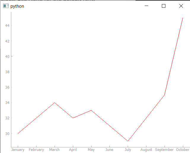
temperature = [30, 32, 34, 32, 33, 31, 29, 32, 35, 45]
self.graphWidget.setBackground("w")
pen = pg.mkPen(color=(255, 0, 0))
# Create a list of (tick_value, tick_label) tuples.
month_labels = [
(m, datetime.date(2020, m, 1).strftime("%B"))
for m in months
]
self.graphWidget.plot(months, temperature, pen=pen)
# Get the bottom axis and apply our custom tick labels.
ax = self.graphWidget.getAxis("bottom")
ax.setTicks([month_labels])
app = QtWidgets.QApplication(sys.argv)
main_window = MainWindow()
main_window.show()
sys.exit(app.exec())
Running this produces a plot where the x-axis displays month names instead of numbers:
Using any string labels
This approach works with any strings, not just month names. If you wanted to label the x-axis with arbitrary category names, you'd follow the same pattern:
labels = [
    (0, "Apples"),
    (1, "Oranges"),
    (2, "Bananas"),
    (3, "Grapes"),
]

ax = self.graphWidget.getAxis("bottom")
ax.setTicks([labels])
As long as you match each label string to the correct numeric position used in your data, the ticks will line up with your plot points.
If you want to plot time series data specifically, take a look at plotting time series data with PyQtGraph for a more detailed approach. You can also embed PyQtGraph into a larger custom widget for more complex applications, or combine it with Matplotlib plotting if you need additional chart types.
Create GUI Applications with Python & Qt6 by Martin Fitzpatrick — (PyQt6 Edition) The hands-on guide to making apps with Python — Save time and build better with this book. Over 15K copies sold.