Kivy is a powerful framework for developing multi-touch GUI applications using Python. It provides a set of rich built-in widgets which you can use to build complex GUI applications.
In a previous tutorial we covered the basic Kivy widgets such as text inputs, buttons and checkboxes. In this tutorial, we will take things further, exploring some of the more complex widgets that Kivy provides. These include: Bubble, DropDown, FileChooser, Popup, Spinner, RecycleView, TabbedPanel, VideoPlayer, and VKeyboard. With these complex Kivy widgets, you can add advanced features to your Python GUI apps.
- Writing an Outline Kivy App
- Providing Option Selections With the Kivy Spinner Widget
- Providing Options With the Kivy DropDown List Widget
- Accessing Files With the Kivy FileChooser Widget
- Building Quick Dialogs With the Kivy Popup Widget
- Creating Contextual Popups With the Kivy Bubble Widget
- Displaying Large Data Sets With the Kivy RecycleView Widget
- Building Tabbed UIs With the Kivy TabbedPanel Widget
- Allowing User Input With the Kivy VKeyboard Widget
- Conclusion
You can download the source code for all our articles.
The code for this article is in the folder kivy/tutorials/kivy-complex-ui-widgets
Writing an Outline Kivy App
We'll start this tutorial with a simple application skeleton, which we will then modify below. Save the following code in a file named app.py:
from kivy.app import App
from kivy.core.window import Window
from kivy.uix.boxlayout import BoxLayout

class WidgetNameApp(App):
    title = "WidgetName Widget"

    def build(self):
        Window.clearcolor = (0, 0.31, 0.31, 1.0)
        Window.size = (360, 640)

        root = BoxLayout()

        return root

WidgetNameApp().run()
Here, we've created a Kivy application with an empty window. The BoxLayout acts as the root widget, this will act as the container to add our complex widgets to. The build() method sets the window's background color to a dark teal shade and adjusts the window size to 360x640 pixels, which is a mobile-friendly size.
To learn more about creating your first Kivy app, check out the Getting Started With Kivy for GUI Development tutorial.
Providing Option Selections With the Kivy Spinner Widget
The Kivy Spinner widget is a dropdown selector that allows users to choose one option from multiple choices. This is ideal when working with a list of simple text choices. Below is an example that builds a Spinner that lets you select from different parts of this website.
from kivy.app import App
from kivy.core.window import Window
from kivy.uix.floatlayout import FloatLayout
from kivy.uix.spinner import Spinner

class SpinnerApp(App):
    title = "Spinner Widget"

    def build(self):
        Window.clearcolor = (0, 0.31, 0.31, 1.0)
        Window.size = (300, 300)

        root = FloatLayout()

        # Create the Spinner
        spinner = Spinner(
            text="Home",
            values=("Home", "Latest", "FAQ", "Forum", "Contact", "About"),
            size_hint=(None, None),
            size=(200, 70),
            pos_hint={"center_x": 0.2, "center_y": 0.9},
            sync_height=True,
        )

        root.add_widget(spinner)

        return root

SpinnerApp().run()
The Spinner widget works as a simple dropdown list, allowing users to select one option from multiple text choices. We've set the Spinner to start with "Home" as the default text and provided other options ("Latest", "FAQ", "Forum", "Contact", and "About") as a list of values.
You need to repeat the "Home" option in values so that you don't lose it when you select another option.
Run it! You'll get an app that looks as shown below.
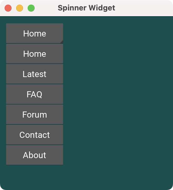 A Kivy app showing a
 Spinner Widget
The dropdown spinner allows users to select from predefined choices. You can use this widget to create elements that work like a dropdown list, optimizing space and providing a clean UI.
Providing Options With the Kivy DropDown List Widget
The Kivy DropDown widget provides a more complex menu component that allows users to choose from multiple options. Like the Spinner, this provides an intuitive way for users to select from a set of choices, but here you can display more than just text. This makes it more complex to use, but allows for more flexibility.
Below is an example of using the DropDown widget to create a dropdown list that lets you select your favorite Python GUI library, displayed on a series of Button objects.
from kivy.app import App
from kivy.core.window import Window
from kivy.uix.boxlayout import BoxLayout
from kivy.uix.button import Button
from kivy.uix.dropdown import DropDown

class DropDownApp(App):
    title = "DropDown Widget"

    def build(self):
        Window.clearcolor = (0, 0.31, 0.31, 1.0)
        Window.size = (200, 200)

        root = BoxLayout(orientation="vertical", padding=10, spacing=10)

        # Create a dropdown with 4 buttons
        dropdown = DropDown()
        for item in ["Kivy", "PyQt6", "PySide6", "Tkinter"]:
            option_btn = Button(text=item, size_hint_y=None, height=50, width=150)
            option_btn.bind(on_release=lambda btn: dropdown.select(btn.text))
            dropdown.add_widget(option_btn)

        # Create a main button to show the dropdown
        button = Button(
            text="Library",
            size_hint=(None, None),
            size=(150, 50),
        )
        button.bind(on_release=dropdown.open)
        dropdown.bind(
            on_select=lambda instance, text: setattr(button, "text", text),
        )
        root.add_widget(button)
        return root

DropDownApp().run()
In this example, we have a DropDown widget that lets the user select a library from a list of options. You populate the dropdown with four options "Kivy", "PyQt6", "PySide6", and "Tkinter", which are displayed in Button objects.
We set each button to trigger the dropdown.select() method when clicked, passing the button's text as the selected value.
Then, we anchor the dropdown to a Library button. When we press the Library button, the dropdown menu opens, displaying the options. Once we select an option, the on_select event updates the main button's text to reflect the chosen library.
Run it! You'll get a window with a dropdown list in the lower left corner. Click in the dropdown widget to change the current selection.
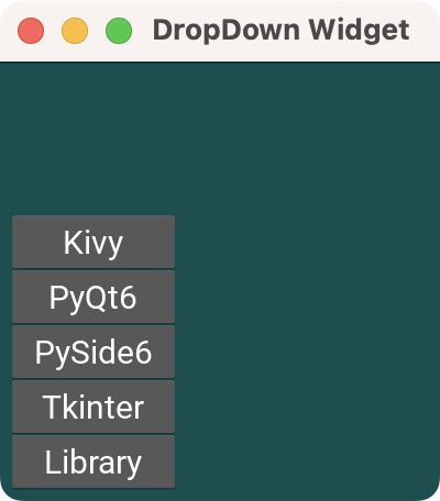 A Kivy app showing a
 DropDown widget
Accessing Files With the Kivy FileChooser Widget
The Kivy filechooser module provides classes for describing, displaying and browsing file systems. In this module there are two ready-made widget views which present the file system as either a list, or as icons. The example below demonstrates both FileChooserIconView and FileChooserListView in action.
from kivy.app import App
from kivy.core.window import Window
from kivy.uix.boxlayout import BoxLayout
from kivy.uix.filechooser import FileChooserIconView, FileChooserListView

class FileChooserApp(App):
    title = "FileChooser Widget"

    def build(self):
        Window.clearcolor = (0, 0.31, 0.31, 1.0)
        Window.size = (360, 640)

        root = BoxLayout(orientation="vertical")

        # Create icon-view and list-view file choosers
        filechooser_icons = FileChooserIconView()
        filechooser_list = FileChooserListView()

        root.add_widget(filechooser_icons)
        root.add_widget(filechooser_list)

        return root

FileChooserApp().run()
In this example, we create file chooser widgets to browse and select files using two different views:
- Icon view (
FileChooserIconView) - List view (
FileChooserListView)
The icon view displays files as wrapped rows of icons, clicking on a folder icon will navigate down into that folder. The list view presents them in a list-tree like format, where clicking on a folder will show files and folders nested under it.
Run it! On macOS, you'll see a window that looks something like the following. Try clicking on the folder icons and entries in the list view to see how navigation works in the two examples.
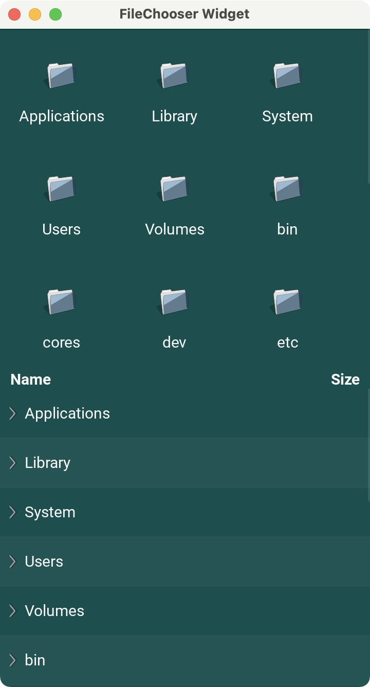 A Kivy app showing file chooser widgets
Building Quick Dialogs With the Kivy Popup Widget
The Kivy Popup widget allows us to display modal dialogs with custom content, layouts and widgets. Popups can be used to show messages or ask for input. The following example displays a simple popup message with a title, message and OK button.
from kivy.app import App
from kivy.core.window import Window
from kivy.uix.boxlayout import BoxLayout
from kivy.uix.button import Button
from kivy.uix.floatlayout import FloatLayout
from kivy.uix.label import Label
from kivy.uix.popup import Popup

class PopupApp(App):
    title = "Popup Widget"

    def build(self):
        Window.clearcolor = (0, 0.31, 0.31, 1.0)
        Window.size = (400, 400)

        root = FloatLayout()

        button = Button(
            text="Open Popup",
            on_press=lambda x: self.show_popup(),
            size_hint=(None, None),
            size=(200, 50),
            pos_hint={"center_x": 0.5, "center_y": 0.5},
        )

        root.add_widget(button)

        return root

    def show_popup(self):
        # Create and show the Popup
        popup = Popup(
            title="Info",
            size_hint=(0.6, 0.6),
            size=(300, 300),
            auto_dismiss=False,
        )

        layout = BoxLayout(orientation="vertical", spacing=10, padding=10)

        message = Label(text="Hello, World!")

        ok_button = Button(text="OK", size_hint=(None, None), size=(80, 40))
        ok_button.bind(on_release=popup.dismiss)

        layout.add_widget(message)
        layout.add_widget(ok_button)

        popup.content = layout
        popup.open()

PopupApp().run()
In this example, you create a Popup widget that displays information as a modal dialog. When the user clicks the Open Popup button, the show_popup() method is triggered, creating a Popup that occupies 60% of the screen in both directions.
We set auto_dismiss to False, which means the popup won't close if we click outside of it. The popup contains the Hello, World! message and an OK button. When we click the button, we dismiss (close) the popup. Popups are effective for displaying alerts, confirmations, or other information in a Kivy app.
Run it! You'll get a window with a button labeled "Open Popup". Click on the Open Popup button to display the popup window.
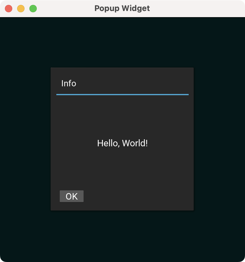 A Kivy app showing a popup dialog
Creating Contextual Popups With the Kivy Bubble Widget
The Kivy Bubble widget is a UI element commonly used for contextual popups, tooltips, or chat applications. Below is a quick Kivy application that shows some text and lets you click on it to change its format. We'll start by importing the necessary objects and subclassing the Bubble class:
from kivy.app import App
from kivy.core.window import Window
from kivy.metrics import dp
from kivy.uix.bubble import Bubble, BubbleButton, BubbleContent
from kivy.uix.floatlayout import FloatLayout
from kivy.uix.label import Label

class FormattingBubble(Bubble):
    def __init__(self, target_text, **kwargs):
        super().__init__(**kwargs)

        # Customizing the bubble
        self.size_hint = (None, None)
        self.size = (dp(120), dp(50))
        self.arrow_pos = "top_mid"
        self.orientation = "horizontal"
        self.target_label = target_text

        # Add formatting buttons
        bold_btn = BubbleButton(text="Bold")
        italic_btn = BubbleButton(text="Italic")
        bold_btn.bind(on_release=lambda x: self.on_format("bold"))
        italic_btn.bind(on_release=lambda x: self.on_format("italic"))

        # Add the buttons to the bubble
        bubble_content = BubbleContent()
        bubble_content.add_widget(bold_btn)
        bubble_content.add_widget(italic_btn)

        self.add_widget(bubble_content)

    def on_format(self, format_type):
        if format_type == "bold":
            self.target_label.text = f"[b]{self.target_label.text}[/b]"
        elif format_type == "italic":
            self.target_label.text = f"[i]{self.target_label.text}[/i]"
        self.parent.remove_widget(self)

class BubbleApp(App):
    title = "Bubble Widget"

    def build(self):
        Window.clearcolor = (0, 0.31, 0.31, 1.0)
        Window.size = (360, 640)

        root = FloatLayout()

        self.text = Label(
            text="Click this text to apply formatting",
            size_hint=(0.8, 0.2),
            pos_hint={"center_x": 0.5, "center_y": 0.5},
            markup=True,
        )
        self.text.bind(on_touch_down=self.show_bubble)

        root.add_widget(self.text)
        root.bind(on_touch_down=self.dismiss_bubbles)

        return root

    def show_bubble(self, instance, touch):
        if instance.collide_point(*touch.pos):
            self.remove_all_bubbles()
            bubble = FormattingBubble(target_text=self.text)
            bubble.pos = (
                touch.x - bubble.width / 2, touch.y - bubble.height - dp(10)
            )
            self.root.add_widget(bubble)

    def dismiss_bubbles(self, instance, touch):
        if instance == self.root and not self.text.collide_point(*touch.pos):
            self.remove_all_bubbles()

    def remove_all_bubbles(self):
        for widget in self.root.children[:]:
            if isinstance(widget, FormattingBubble):
                self.root.remove_widget(widget)
                return

BubbleApp().run()
The FormattingBubble class inherits from Bubble and provides text formatting options for a label. It initializes with a specific size, arrow position, and horizontal layout. The bubble will contain two buttons: Bold and Italic. When pressed, these buttons apply the respective formatting to the target text by triggering the on_format() method. This method wraps the text in Kivy's markup tags [b]...[/b] for bold and [i]...[/i] for italic.
The BubbleApp class represents the Kivy application. It sets up a FloatLayout with a centered Label displaying a message. When the user taps the label, the show_bubble() method creates and positions a FormattingBubble above the tapped location.
The app also ensures that only one bubble is visible at a time by removing existing ones before showing a new one. Additionally, tapping outside the label dismisses any active bubbles using the dismiss_bubbles() method.
Run it! The app features a dark teal background and a mobile-friendly window size. The Bubble widget appears when we click the text.
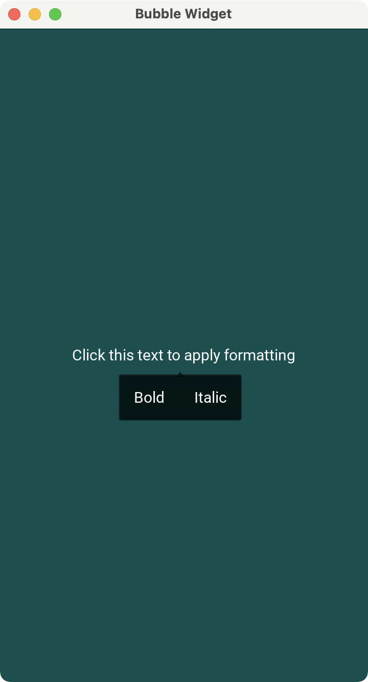 A Kivy app showing a
 Bubble widget
Displaying Large Data Sets With the Kivy RecycleView Widget
The Kivy RecycleView widget efficiently displays large data sets by recycling views or graphical elements. Instead of creating a widget for every item in the dataset, RecycleView reuses a small number of widgets to display visible items only, significantly improving performance.
To illustrate, let's create a view that lets you inspect a database of employee profiles. The data is stored in a CSV file that looks like the following:
name,job,department
John Smith,Developer,IT
Jane Doe,Designer,Graphics
Anne Frank,Artist,Painting
David Lee,Engineer,Civil
Ella Brown,Doctor,Medical
Frank Thomas,Chef,Culinary
Henry Ford,Driver,Transport
Nathan Young,Consultant,Business
Olivia King,Manager,Administration
Peter Wright,Director,Management
Queen Bell,President,Executive
Walter Thompson,Assistant,Support
Xena Garcia,Associate,Associate
Zack Harris,Consultant,Consulting
You can read and load this data with the csv module. To visualize the data, you can create a view with the RecycleView widget. For the individual views, you can use the Button widget, which will let you display the employee's profile:
import csv

from kivy.app import App
from kivy.core.window import Window
from kivy.metrics import dp
from kivy.uix.boxlayout import BoxLayout
from kivy.uix.button import Button
from kivy.uix.label import Label
from kivy.uix.popup import Popup
from kivy.uix.recycleboxlayout import RecycleBoxLayout
from kivy.uix.recycleview import RecycleView

class EmployeesView(RecycleView):
    def __init__(self, **kwargs):
        super().__init__(**kwargs)
        self.employees_data = self._read_from_csv()

        # Load the employees data into the data attribute
        self.data = [
            {
                "text": f"{employee['name']}",
                "on_release": self._create_callback(employee["name"]),
            }
            for employee in self.employees_data
        ]

        layout_manager = RecycleBoxLayout(
            default_size=(None, dp(56)),
            default_size_hint=(1, None),
            size_hint_y=None,
            orientation="vertical",
        )
        layout_manager.bind(minimum_height=layout_manager.setter("height"))

        self.add_widget(layout_manager)
        self.viewclass = "Button"

    def _create_callback(self, name):
        return lambda: self.on_button_click(name)

    def _read_from_csv(self):
        with open("employees.csv", mode="r") as file:
            return [row for row in csv.DictReader(file)]

    def on_button_click(self, name):
        popup = Popup(
            title=f"{name}'s Profile",
            size_hint=(0.8, 0.5),
            size=(300, 300),
            auto_dismiss=False,
        )
        employees_data = [
            employee for employee in self.employees_data if employee["name"] == name
        ]
        profile = "\n".join(
            [f"{key.capitalize()}: {value}" for key, value in employees_data[0].items()]
        )
        layout = BoxLayout(orientation="vertical", spacing=10, padding=10)
        message = Label(text=profile)
        ok_button = Button(text="OK", size_hint=(None, None))
        ok_button.bind(on_release=popup.dismiss)
        layout.add_widget(message)
        layout.add_widget(ok_button)
        popup.content = layout
        popup.open()

class RecycleViewApp(App):
    title = "RecycleView Widget"

    def build(self):
        Window.clearcolor = (0, 0.31, 0.31, 1.0)
        Window.size = (360, 640)

        return EmployeesView()

RecycleViewApp().run()
In this example, we subclass RecycleView to display the list of employees loaded from a CSV file. The _read_from_csv() method opens the file and reads the data using the csv.DictReader() class, which converts each CSV line into a dictionary whose keys come from the file header line.
The data attribute is key for the app to work because it'll hold the data that we want to display. To arrange widgets in a RecycleView, we use a RecycleBoxLayout. The viewclass attribute lets us set the widget that we'll use to display each data item.
It's important to note that for the RecycleView to work properly, we should set viewclass at the end when the data is already loaded and the layout is set up.
Then, we populate the RecycleView view with buttons, each displaying an employee's name. Clicking a button triggers _create_callback(), which generates a callback that opens a popup displaying the selected employee's profile details.
Run it! You'll get a nice-looking window listing the employees. Click a button to view the associated employee's profile. Scroll down to load more profiles.
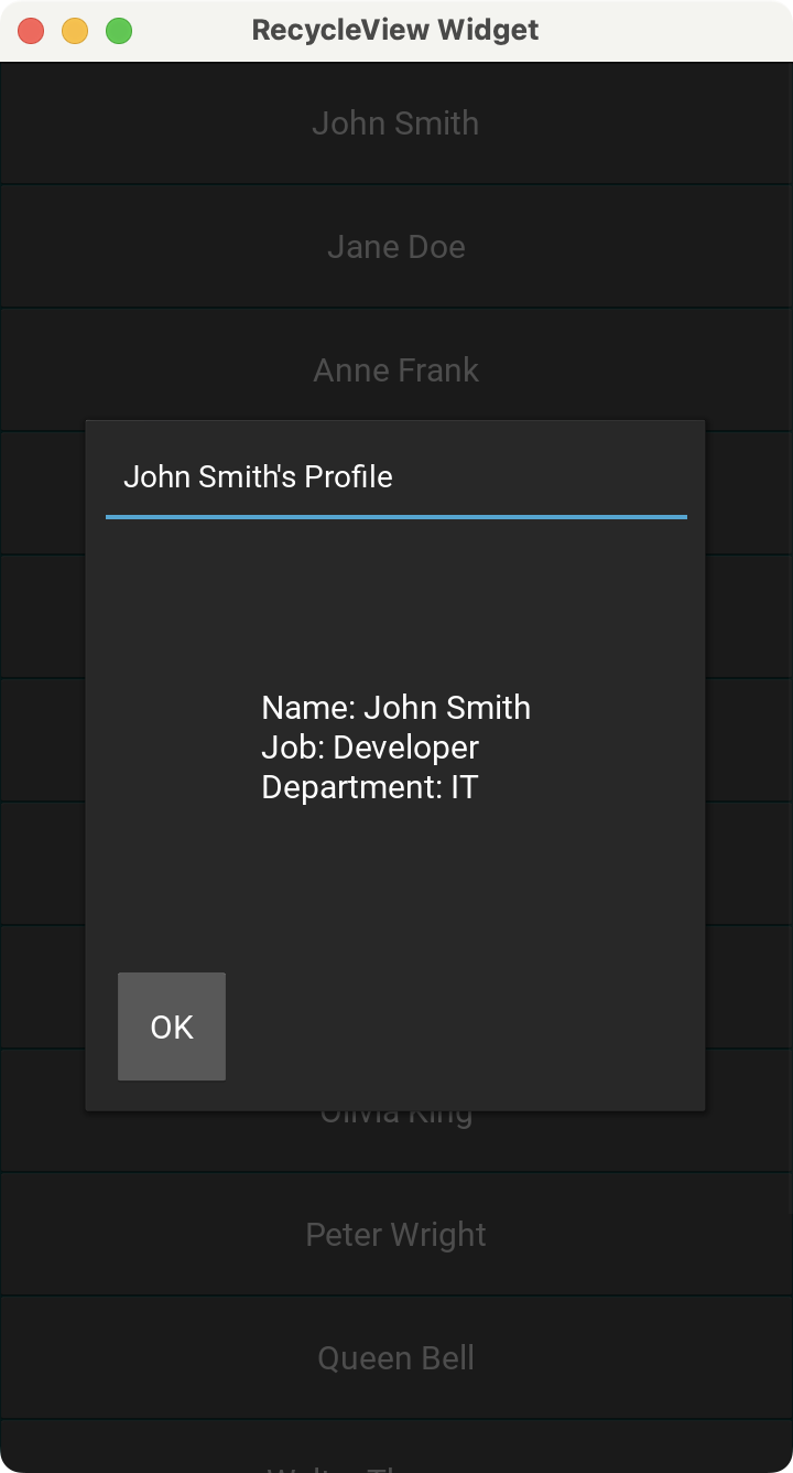 A Kivy app showing a
 RecycleView Widget
Building Tabbed UIs With the Kivy TabbedPanel Widget
The Kivy TabbedPanel widget lets us organize content into tabs, to improve navigation and optimize the use of space. This is commonly used in settings dialogs where there are lots of options available.
from kivy.app import App
from kivy.core.window import Window
from kivy.uix.boxlayout import BoxLayout
from kivy.uix.label import Label
from kivy.uix.tabbedpanel import TabbedPanel, TabbedPanelHeader

class TabbedPanelApp(App):
    title = "TabbedPanel Widget"

    def build(self):
        Window.clearcolor = (0, 0.31, 0.31, 1.0)
        Window.size = (360, 640)

        # Create the TabbedPanel
        root = TabbedPanel(do_default_tab=False)

        # Create the tabs
        general_tab = TabbedPanelHeader(text="General")
        general_content = BoxLayout(orientation="vertical", padding=10, spacing=10)
        general_content.add_widget(Label(text="General Settings", font_size=40))
        general_tab.content = general_content
        root.add_widget(general_tab)

        editor_tab = TabbedPanelHeader(text="Editor")
        editor_content = BoxLayout(orientation="vertical", padding=10, spacing=10)
        editor_content.add_widget(Label(text="Editor Settings", font_size=40))
        editor_tab.content = editor_content
        root.add_widget(editor_tab)

        profile_tab = TabbedPanelHeader(text="Profile")
        profile_content = BoxLayout(orientation="vertical", padding=10, spacing=10)
        profile_content.add_widget(Label(text="User Profile", font_size=40))
        profile_tab.content = profile_content
        root.add_widget(profile_tab)

        return root

TabbedPanelApp().run()
In this example, we create a Kivy app that shows a tabbed interface using the TabbedPanel widget. It disables the default tab and manually adds three tabs: General, Editor, and Profile, each represented by a TabbedPanelHeader object.
Inside the tabs, we place a BoxLayout to hold a label that displays a description as a placeholder tab content. Tabs allow us to organize content into visually distinct sections within an application's UI.
Run it! Your app will display three tabs. When you click the tab header, the app shows the tab's content. The active tab shows a light blue line at the bottom.
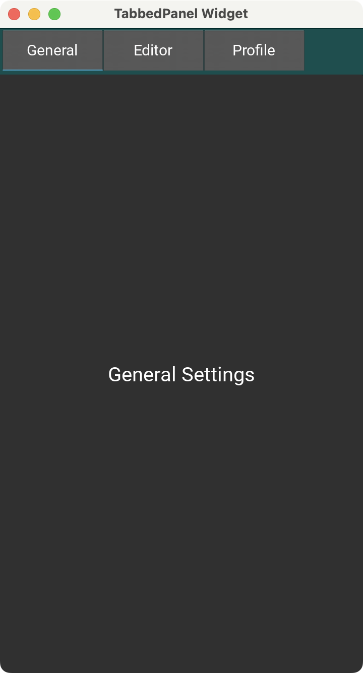 A Kivy app showing a
 TabbedPanel Widget
Try and add some more widgets to each tab panel.
Allowing User Input With the Kivy VKeyboard Widget
The Kivy VKeyboard widget allows you to create a virtual keyboard that is useful for touchscreen applications that require the user to type in text. Below is a short app that demonstrates a virtual keyboard in action. When you type text using the keyboard, it is displayed on the label.
from kivy.app import App
from kivy.core.window import Window
from kivy.uix.boxlayout import BoxLayout
from kivy.uix.label import Label
from kivy.uix.vkeyboard import VKeyboard

class VKeyboardApp(App):
    title = "VKeyboard Widget"

    def build(self):
        Window.clearcolor = (0, 0.31, 0.31, 1.0)
        Window.size = (360, 640)

        root = BoxLayout(orientation="vertical")

        self.display_label = Label(text="Type in!", font_size=40)
        root.add_widget(self.display_label)

        # Create the virtual keyboard
        keyboard = VKeyboard(size_hint=(1, 0.4))
        keyboard.bind(on_key_up=self.keyboard_on_key_up)
        root.add_widget(keyboard)

        return root

    def keyboard_on_key_up(self, *args):
        keycode = args[1]
        text = args[2]
        if keycode == "backspace":
            if (
                len(self.display_label.text) > 0
                and self.display_label.text != "Type in!"
            ):
                self.display_label.text = self.display_label.text[:-1]
                if self.display_label.text == "":
                    self.display_label.text = "Type in!"
        elif keycode == "spacebar":
            if self.display_label.text == "Type in!":
                self.display_label.text = " "
            else:
                self.display_label.text += " "
        elif keycode in {"enter", "shift", "alt", "ctrl", "escape", "tab", "capslock"}:
            pass
        else:
            if self.display_label.text == "Type in!":
                self.display_label.text = text
            else:
                self.display_label.text += text

VKeyboardApp().run()
In this example, we manually add a virtual keyboard to our app's interface using the VKeyboard widget and display typed text using a label.
When a key is released, the keyboard_on_key_up() method processes the input. Printable characters are appended to the label text. Backspace removes the last character, and the spacebar inserts a space.
You typically wouldn't use the VKeyboard widget as in the example above. Input widgets, like TextInput, will automatically bring up the virtual keyboard when focused on mobile devices.
We ignore special keys like Enter, Shift, Alt, Ctrl, and Escape. This allows us to interact with a virtual keyboard and see the input displayed dynamically in the label.
Run it! A virtual keyboard appears at the button of the app's window, allowing you to enter text in touch-based devices. When you type on the virtual keyboard at the bottom of the app's window, the label reflects what you've typed.
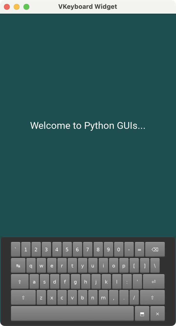 A Kivy app showing a
 VKeyboard Widget
Conclusion
Kivy provides a rich set of complex UX widgets that you can use to create cross-platform Python GUI applications. In this tutorial, you learned how to use the Spinner for dropdown selections, DropDown for custom menus, FileChooser for file browsing, Popup for modal dialogs, Bubble for contextual popups, RecycleView for efficiently displaying large data sets, TabbedPanel for tabbed interfaces, and VKeyboard for virtual keyboard input. Using the examples above as inspiration, you should now be able to integrate these complex Kivy widgets into your own Python apps. See if you can extend these examples further, adding more widgets or functionality to them.
Packaging Python Applications with PyInstaller by Martin Fitzpatrick
This step-by-step guide walks you through packaging your own Python applications from simple examples to complete installers and signed executables.