Streamlit is a powerful Python library designed to build interactive web apps with minimal code. One of its core features is an extensive collection of widgets that allow users to interact with the app in various ways, such as providing inputs, triggering actions, or visualizing data. Streamlit makes it easy to create these elements with simple, intuitive syntax.
In the previous tutorial, we saw how to get started with Streamlit and run it on your local host. Here, we'll cover the main widgets available in Streamlit, explaining how they work, and how to customize them using various examples.
Getting started with Widgets Streamlit
Widgets in Streamlit are simple yet customizable. By combining multiple widgets together in different layouts, you can create interactive dashboards, data visualizations, and forms. Whether you want to include buttons, sliders, checkboxes, or display tables and plots, Streamlit offers a wide range of widgets that cater to different needs. Adding a widget to your Streamlit app is as easy as calling a single function, and customizing its behavior requires only minimal code.
In this guide, we will explore the various widgets that Streamlit offers, from basic input elements like text boxes and radio buttons to more complex visual components like plots and tables. We'll also dive into how to customize the behavior of these widgets to suit your app's specific requirements, such as adjusting slider ranges, modifying button text, and adding captions to images. By the end of this article, you'll have a solid understanding of how to leverage Streamlit widgets to enhance the interactivity and functionality of your applications.
Let's start by exploring the basic widgets Streamlit provides and how you can easily integrate them into your app. Make sure you have installed the streamlit module on your system and imported it on your Python file.
Buttons in Streamlit
Buttons are one of the most essential and commonly used components in any interactive application. In Streamlit, the st.button() widget provides an easy and effective way to allow users to trigger actions, interact with your app, or make decisions. With just a few lines of Python code, you can integrate buttons into your Streamlit app to perform tasks like data processing, changing app state, or displaying content.
The st.button() widget creates a clickable button on the interface. When clicked, it returns True, which can be used to trigger specific actions. If the button is not clicked, it returns False.
The basic syntax for creating a button in Streamlit is given below:
import streamlit as st
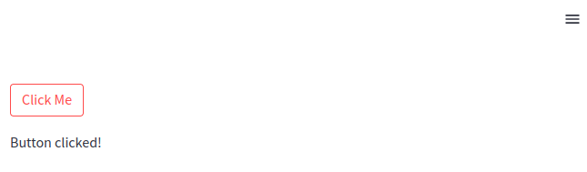
if st.button('Click Me'):
st.write("Button clicked!")
 A Streamlit button widget
PyQt/PySide Office Hours 1:1 with Martin Fitzpatrick — Save yourself time and frustration. Get one on one help with your projects. Bring issues, bugs and questions about usability to architecture and maintainability, and leave with solutions.
In this simple example, the button's label is "Click Me". When clicked, the app prints "Button clicked!" to the interface.
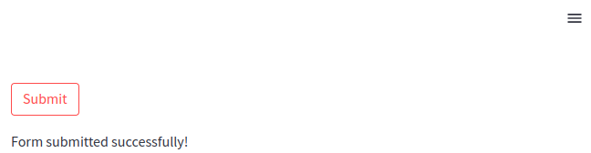
The most common customization for a button is its label — the text that appears on the button. The label is the first argument you pass to the st.button() function. For example, we can change the "Click Me" to a "Submit" button.
import streamlit as st
if st.button('Submit'):
    st.write("Form submitted successfully!")
 A Streamlit button widget with a different label
You can customize this label to suit the action you want to convey to the user. Whether it's Submit, Cancel, Run, or any custom text, Streamlit will display it as the button text
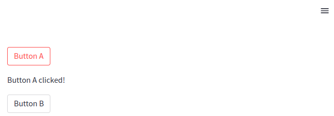
Moreover, Streamlit makes it simple to handle multiple buttons on the same page. You can define multiple st.button() widgets, each with its own label and action. Here is an example of how we can add multiple buttons.
import streamlit as st
if st.button('Button A'):
    st.write("Button A clicked!")

if st.button('Button B'):
    st.write("Button B clicked!")
 Multiple Streamlit buttons
Similarly, you can add as many buttons as you wish.
Checkboxes in Streamlit
Checkboxes are a fundamental widget in Streamlit that allows users to toggle between two states: checked True or unchecked False. They are ideal for scenarios where you want users to make binary choices, such as showing or hiding content, enabling or disabling features, or making Yes/No decisions. It can also be used to select multiple options as the same time as well. The st.checkbox() widget is incredibly versatile and easy to implement, making it a key component in creating interactive applications.
As mentioned, the st.checkbox() widget creates a simple checkbox in your Streamlit app. When a user checks the box, it returns True, and when the box is unchecked, it returns False. Here is a basic example of checkboxes in Streamlit.
show_text = st.checkbox('Show text')
if show_text:
    st.write("You checked the box!")
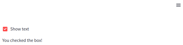 Streamlit checkbox
In this example, the checkbox is labeled "Show text". When the user checks the box, the app displays "You checked the box!" on the interface.
The most common customization for a checkbox is its label, which appears next to the checkbox itself. This label should clearly indicate what action will occur when the checkbox is checked.
subscribe = st.checkbox('Subscribe to our newsletter')
if subscribe:
    st.write("Thanks for subscribing!")
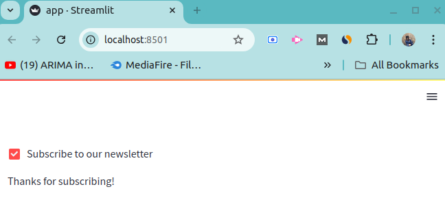 Streamlit checkbox with custom label
Here, the checkbox label is customized to "Subscribe to our newsletter", and when the user checks it, a thank-you message is displayed.
By default, checkboxes in Streamlit are unchecked (False). However, you can change this by setting the value parameter to True, so that the checkbox is pre-checked when the app loads.
subscribe = st.checkbox('Subscribe to our newsletter', value=True)
if subscribe:
    st.write("Thanks for subscribing!")
In this case, the checkbox is checked by default, and the welcome message is shown immediately when the app starts.
Furthermore, Streamlit makes it easy to handle multiple checkboxes, each controlling different parts of your app. You can create several checkboxes, and based on their states, you can conditionally display content or execute logic.
option1 = st.checkbox('Enable Feature 1')
option2 = st.checkbox('Enable Feature 2')

if option1:
    st.write("Feature 1 is enabled!")
if option2:
    st.write("Feature 2 is enabled!")
Multiple Streamlit checkboxes
Sometimes, you may need to generate checkboxes dynamically, especially if the number of checkboxes depends on user input or the result of some computation.
options = ['Apple', 'Banana', 'Cherry']
selected = []

for fruit in options:
    if st.checkbox(fruit):
        selected.append(fruit)

st.write(f'Selected fruits: {", ".join(selected)}')
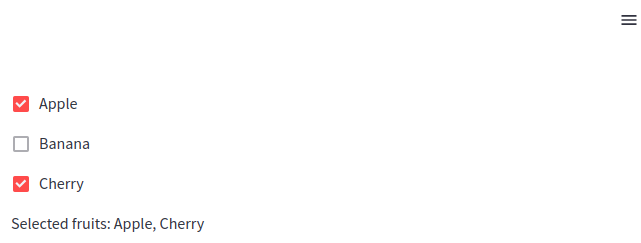 Getting Streamlit checkboxes selection state
In this example a list of fruit names is used to dynamically create a set of checkboxes. When a user checks a box, the corresponding fruit is added to a list, and the selected fruits are displayed.
Radio buttons in Streamlit
Radio buttons are an essential widget in Streamlit that allow users to select a single option from a predefined list of choices. They are perfect for scenarios where only one selection can be made at a time, such as selecting a category, choosing between modes, or answering questions. The st.radio() widget provides an intuitive and simple way for users to interact with your Streamlit application.
The st.radio() widget creates a list of radio buttons where the user can select only one option at a time. It returns the selected option, which can be used to drive various actions in the app. Let us have a look at a very simple example of a radio button.
choice = st.radio('Choose an option:', ['Option 1', 'Option 2', 'Option 3'])
st.write(f'You selected: {choice}')
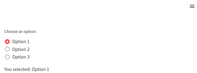 Streamlit radio buttons
In this example:
- A label "Choose an option:" is provided.
- The user can select one of three options: "Option 1", "Option 2", or "Option 3".
- The app displays the selected option below the radio buttons.
By default, the first option in the list of radio buttons is selected. However, you can customize this by setting the index parameter, which specifies which option should be selected when the app loads.
travel_mode = st.radio('Preferred mode of travel:', ['Car', 'Bike', 'Plane'], index=2)
st.write(f'You selected: {travel_mode}')
Streamlit radio buttons with default selection
The index=2 means the third option ("Plane") is selected by default when the app is loaded.
Select box in Streamlit
A select box in Streamlit is a widget that lets users choose a single option from a dropdown list. This widget is perfect for situations where you have a predefined list of options but want to save space on your interface by not displaying all the options upfront. The st.selectbox() widget is highly customizable and can be used for anything from simple selections to dynamically populated lists. It's ideal for situations where you want to offer multiple choices, but only display the currently selected item.
Let us create a simple dropdown menu with three options.
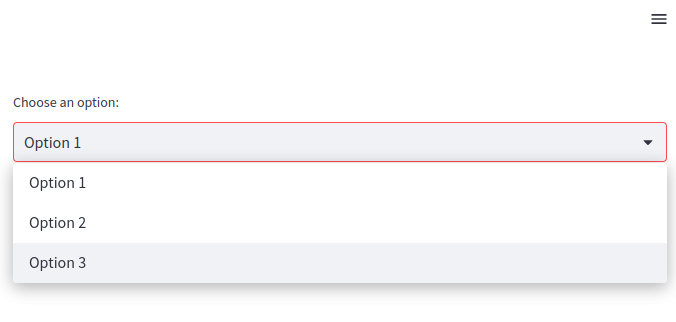
option = st.selectbox('Choose an option:', ['Option 1', 'Option 2', 'Option 3'])
st.write(f'You selected: {option}')
 Streamlit select box
In this example:
- A label "Choose an option:" is provided.
- The user can select one of the options from the dropdown list: "Option 1", "Option 2", or "Option 3".
- The app displays the selected option.
By default, the first item in the list of options is selected in a select box. However, you can specify a different default selection by setting the index parameter. The index corresponds to the zero-based position of the option in the list.
city = st.selectbox('Select your city:', ['New York', 'London', 'Paris', 'Tokyo'], index=2)
st.write(f'You selected: {city}')
When you run this code, you will notice that, Paris will be selected as city because it is at index 2.
Slider in Streamlit
Sliders are a popular widget in Streamlit that allows users to select values by dragging a handle across a range. They are perfect for collecting numerical inputs or setting parameters like dates, time, and ranges. Streamlit's st.slider() widget provides a flexible and easy-to-use interface for adding sliders to your app, enabling users to interactively choose values with precision. It can handle integers, floats, dates, and times, making it highly versatile for various use cases.
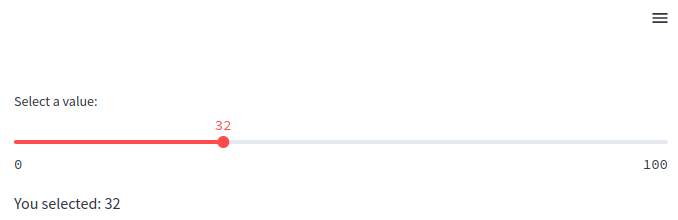
Let us create a simple slider where a user can select any number from 0 to 100.
value = st.slider('Select a value:', 0, 100)
st.write(f'You selected: {value}')
 Streamlit slider widget
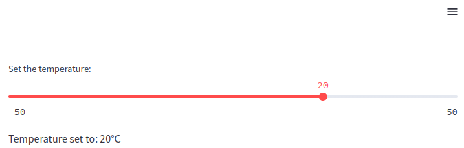
By default, the slider handle is set to the minimum value of the range, but you can specify a default value by providing a value argument. This is useful when you want the slider to start at a specific position.
temperature = st.slider('Set the temperature:', -50, 50, value=20)
st.write(f'Temperature set to: {temperature}°C')
 Streamlit slider widget with default value
By default, the 20 will be selected as set temperature.
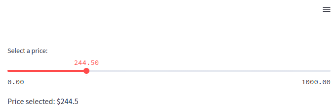
Sliders in Streamlit can handle both integers and floating-point numbers. To use floating-point values, you simply specify a range with float values. You can also control the step size between values using the step parameter.
price = st.slider('Select a price:', 0.0, 1000.0, step=0.5)
st.write(f'Price selected: ${price}')
 Streamlit float slider widget
In this example:
- The
sliderlets the user select a price between 0.0 and 1000.0. - The
step=0.5ensures that the slider increments or decrements by 0.5 units.
Streamlit's slider widget also allows users to select a range of values, which is particularly useful when you need two values (e.g., a start and end date, or a minimum and maximum range). To do this, provide a tuple as the value argument.
salary_range = st.slider('Select a salary range:', 20000, 100000, (30000, 80000))
st.write(f'Selected salary range: ${salary_range[0]} - ${salary_range[1]}')
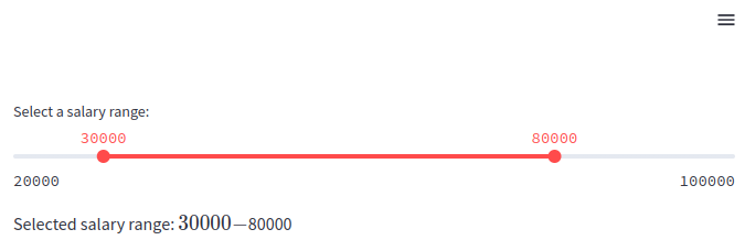 Streamlit range slider widget
Here, the slider has a range from 20000 to 100000. The user can select a minimum and maximum value for the salary range (initially set between 30000 and 80000).
Apart from that, Streamlit sliders can also handle date and time values, which is especially useful when users need to select a specific day or time range. You can create sliders with datetime.date and datetime.time objects to allow users to make date-based selections.
import streamlit as st
import datetime

date = st.slider('Select a date:', datetime.date(2020, 1, 1), datetime.date(2024, 12, 31), value=datetime.date(2023, 1, 1))
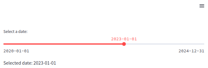 Streamlit date slider
In this example, the user can select a date between January 1, 2020, and December 31, 2024. The default value is set to January 1, 2023.
You can use sliders with any other widgets or functions to make it more dynamic and interactive. For example, we can combine them with conditional logic to adjust the behavior or content of an app based on the selected value. This is particularly useful for creating dynamic and interactive experiences.
rating = st.slider('Rate our service:', 1, 5)

if rating <= 2:
    st.write('We are sorry to hear that. Please let us know how we can improve.')
else:
    st.write('Thank you for your feedback!')
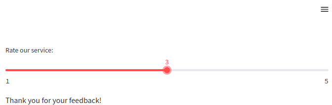 Streamlit slider interactivity
The slider allows users to rate a service between 1 and 5. Based on the rating, different messages are displayed.
Different input options in Streamlit
In Streamlit, input options are essential for creating interactive applications, allowing users to interact with data and visualizations dynamically. Streamlit offers a variety of input widgets that cater to different types of data and user interactions. Below are the main input options that we will be discussing in this section:
- Text Input: The
st.text_input()widget allows users to enter single-line text data. It's useful for collecting short information like names, email addresses, or any single-line text input. - Text Area: For multi-line input,
st.text_area()is the preferred choice. It provides users with a larger space for entering longer content, like descriptions, notes, or code snippets. - Number Input: Streamlit provides the
st.number_input()widget for numerical inputs. Users can specify integer or float values within a defined range and step size, which makes it suitable for settings like entering age, prices, or percentages. - Date and Time Input: For handling date and time, Streamlit provides the
st.date_input()andst.time_input()widgets, allowing users to pick dates and times easily. This is useful for scheduling or filtering data by time ranges.
Now, let us discuss each of these options in details by taking examples.
Date and Time Input
Among its many features, Streamlit provides robust support for handling date and time inputs, allowing developers to easily integrate date and time pickers into their applications. This is useful in a wide variety of contexts, such as scheduling applications, time series analysis, filtering data based on time ranges, or tracking events.
The st.date_input() widget in Streamlit provides a simple and intuitive interface for users to select dates. This widget can be used to input a single date or a range of dates. The basic syntax of date_input() function is given below will possible parameter values.
st.date_input("Date", value=None, min_value=None, max_value=None, key=None, help=None, on_change=None)
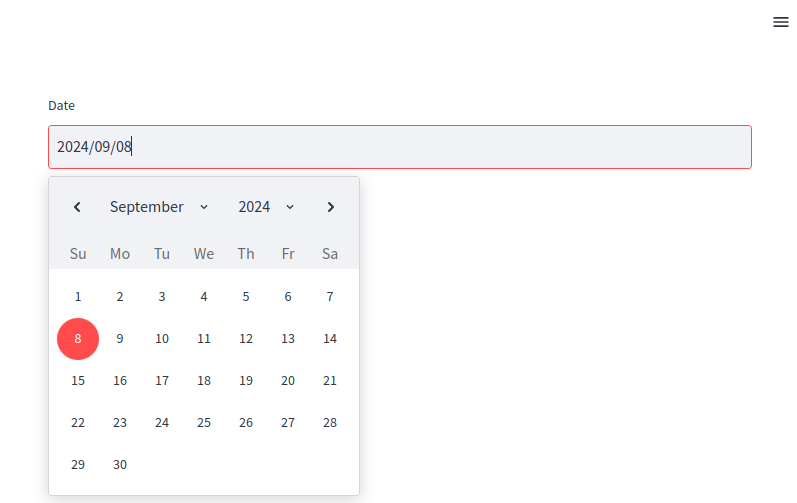 Streamlit date input
Let us explore the parameters in turn:
label: The label to display alongside the widget.value: The default date(s) to show in the widget. This can be a single date or a tuple of two dates for range selection. Defaults to today's date.min_value: The earliest date that can be selected. Defaults to no minimum.max_value: The latest date that can be selected. Defaults to no maximum.key: An optional key that uniquely identifies this widget.help: A tooltip that displays when the user hovers over the widget.on_change: A callback function that runs when the input changes.
In addition to that, you can also use st.date_input() to allow users to pick a range of dates by passing a tuple of two datetime.date objects as the default value.
import streamlit as st
import datetime

# Date range input
start_date = datetime.date(2023, 9, 1)
end_date = datetime.date(2023, 9, 30)
date_range = st.date_input("Select a date range", (start_date, end_date))
st.write(f"Start date: {date_range[0]}")
st.write(f"End date: {date_range[1]}")
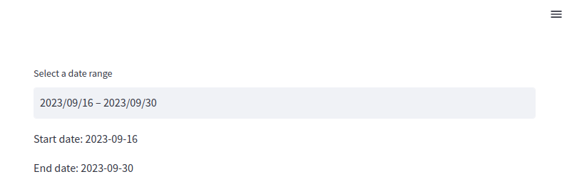 Streamlit date range input
In this case, the user can select a range of dates. The widget will return a tuple containing the start and end dates.
On the other hand, the st.time_input() widget allows users to select a specific time. This widget is useful in scenarios like scheduling events or setting alarms. Here is the simple syntax off time_input() function with its possible parameter values.
st.time_input(label="Time", value=None, key=None, help=None, on_change=None)
Streamlit time input
The parameters in the time_input functions:
label: The label displayed next to the widget.value: The default time shown in the widget. This can be a datetime.time object. Defaults to the current time.key: An optional key that uniquely identifies the widget.help: Tooltip displayed when the user hovers over the widget.on_change: A callback function that runs when the input changes.
In many applications, you'll need both date and time inputs together. Although Streamlit doesn't provide a single widget for selecting both date and time, you can combine the st.date_input() and st.time_input() widgets to achieve this functionality.
import streamlit as st
import datetime

# Date input
date = st.date_input("Pick a date", datetime.date.today())
# Time input
time = st.time_input("Pick a time", datetime.time(9, 00))

# Combine date and time
selected_datetime = datetime.datetime.combine(date, time)
st.write(f"Selected date and time: {selected_datetime}")
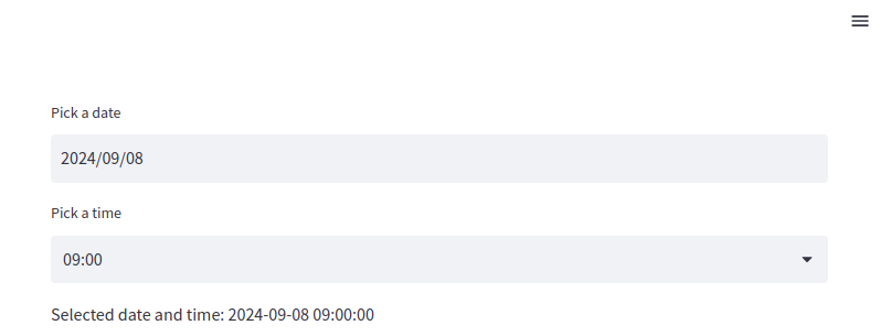 Combining Streamlit widgets for selecting date and time
This code lets the user select both a date and a time, then combines them into a single datetime.datetime object.
Text and area input
One of the essential features of any web app is gathering user input, and Streamlit provides several widgets to capture user input easily. Among them, text input widgets play a crucial role in allowing users to input free-form text data. In this article, we will dive into Streamlit's text input widgets and explore their capabilities, practical applications, and customization options.
Streamlit offers two primary widgets for capturing text input:
- Single-Line Text Input: Captured using the
st.text_input()widget. - Multi-Line Text Area: Captured using the
st.text_area()widget.
Both widgets are used to gather text-based input from users but differ in the amount of text they are designed to handle. Let's take a closer look at each of these widgets.
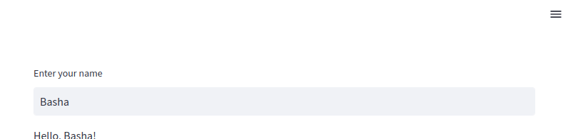
The st.text_input() widget allows users to input a single line of text. This is ideal for cases where you want to gather short responses such as names, email addresses, usernames, search queries, or small pieces of data.
# Single-line text input
name = st.text_input("Enter your name")
st.write(f"Hello, {name}!")
 Streamlit text input widget
This example creates a simple input box where users can enter their names. The app then displays a message using the entered text.
In some cases, we may need to limit the total number of characters entered by the user. So, we can use the max_charsparameter as shown below:
# Text input with character limit
username = st.text_input("Enter your username", max_chars=15)
st.write(f"Your username is: {username}")
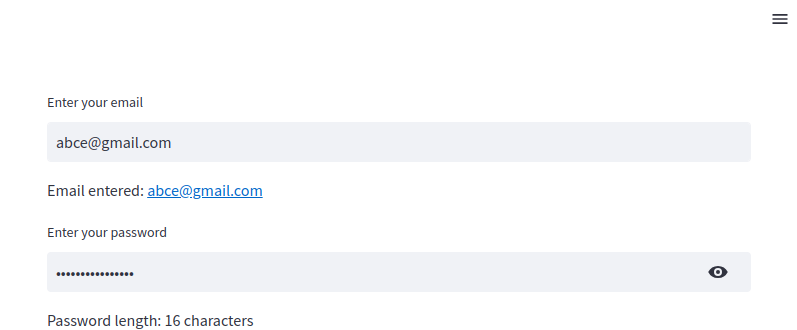
This is similar to the previous example, but this time the user is not allowed to enter characters more than 15. In the text_input() function, we can also specify the type of text we want the user to enter. For example, if we want a user to enter an email and password, we can specify those as shown below:
email = st.text_input("Enter your email")
st.write(f"Email entered: {email}")
password = st.text_input("Enter your password", type='password')
st.write(f"Password length: {len(password)} characters")
 Streamlit password input widget
As shown above, when we enter the password, it will not be visible.
The st.text_area() widget is ideal when you need to capture longer inputs or multi-line text, such as feedback, code snippets, or detailed descriptions. It provides users with a resizable text area where they can enter more extensive information
# Multi-line text area
feedback = st.text_area("Your feedback", "Enter your comments here...")
st.write(f"Your feedback: {feedback}")
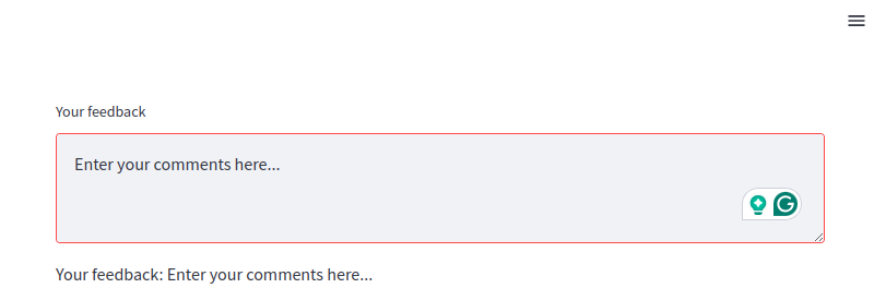 Streamlit text area for text input
In this example, the text area allows the user to enter multiple lines of text. The entered feedback is then displayed. In a similar way as we did before, you can limit the max number of characters by assigning a value to the max_chars parameter.
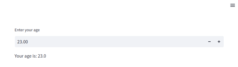
Number Input in Streamlit
The st.number_input() widget allows users to input numbers, offering several customization options like setting minimum and maximum values, adjusting step increments, and choosing between integers and floating-point numbers. This widget is particularly useful for inputs like prices, quantities, percentages, or any scenario where numerical precision is required.
The simplest form of the st.number_input() widget involves asking the user to input a number without setting any constraints like minimum or maximum values.
age = st.number_input("Enter your age")
st.write(f"Your age is: {age}")
 Streamlit numeric input
In this example, the widget accepts any number, and the user's input is displayed back on the screen.
You can restrict the input to a certain range by specifying the min_value and max_value parameters. This is particularly useful when you need to validate the input against specific boundaries.
# Number input with a range
rating = st.number_input("Rate your experience", min_value=1, max_value=5)
st.write(f"Your rating is: {rating}")
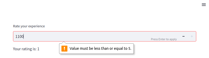 Numeric input with validation
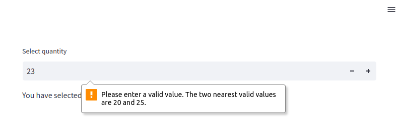
In this example, the user can only select a rating between 1 and 5, ensuring valid input. You can set a default value that appears in the input box when the app first loads, and you can also define how much the value should increase or decrease when the user interacts with the widget.
# Number input with default value and step size
quantity = st.number_input("Select quantity", min_value=0, max_value=100, value=10, step=5)
st.write(f"You have selected: {quantity} units")
 Numeric input with validation and step size
In this example, the widget starts with a default value of 10, and the user can adjust the value in increments of 5, from 0 to 100.
File uploader in Streamlit
st.file_uploader() widget, which allows users to upload files directly into your Streamlit app. This functionality is vital in many applications, such as data analysis tools, machine learning models, and document processing systems. This widget is a convenient tool for enabling users to upload files of various types, such as text files, CSVs, images, PDFs, and more. Once uploaded, the files can be processed or analyzed directly within the Streamlit app.
The simplest use case of st.file_uploader() is to upload a single file of a specific type.
import pandas as pd

# Single file uploader for CSV files
uploaded_file = st.file_uploader("Upload a CSV file", type="csv")

if uploaded_file is not None:
    df = pd.read_csv(uploaded_file)
    st.write(df)
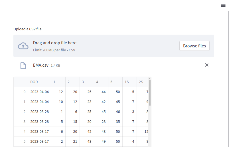 Upload CSV files
In this example, the user can upload a CSV file, and the app reads and displays the contents using the pandas library.
We can also upload images and show them in our web app. For images, we need to specify the type of images as shown in the example below:
import streamlit as st
from PIL import Image

# Upload an image file
uploaded_image = st.file_uploader("Upload an image", type=["png", "jpg", "jpeg"])

if uploaded_image is not None:
    image = Image.open(uploaded_image)
    st.image(image, caption="Uploaded Image", use_column_width=True)
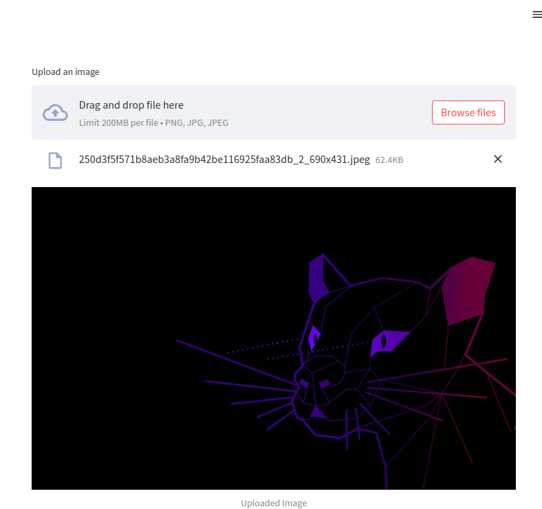 Upload image files
Here, users can upload image files in formats like PNG, JPG, or JPEG. Once uploaded, the app uses the Pillow library to open and display the image.
Furthermore, you can use the accept_multiple_files parameter to allow users to upload several files at once. This is useful when handling bulk uploads or cases where multiple files need to be processed together.
# Multiple file uploader for text files
uploaded_files = st.file_uploader("Upload multiple text files", type="txt", accept_multiple_files=True)

if uploaded_files:
    for uploaded_file in uploaded_files:
        st.write(f"File name: {uploaded_file.name}")
        content = uploaded_file.read().decode("utf-8")
        st.write(content)
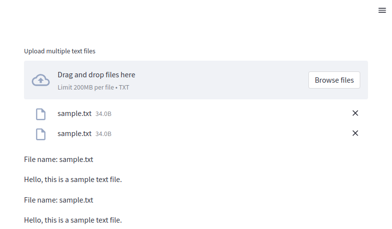 Uploading multiple files
In this example, the user can upload multiple text files. The app reads and displays the contents of each file.
Streamlit also allows you to validate uploaded files based on specific conditions, such as file size, format, or content.
uploaded_file = st.file_uploader("Upload a file")

if uploaded_file is not None:
    # Check file size (less than 2 MB)
    file_size = uploaded_file.size
    if file_size > 2 * 1024 * 1024:
        st.error("File size exceeds 2 MB limit!")
    else:
        st.success("File uploaded successfully.")
        st.write(f"File size: {file_size} bytes")
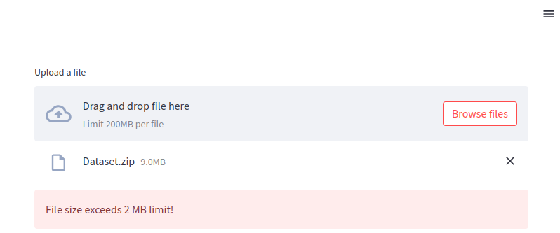 Uploading file too large
As you can see, the file was not uploaded because it exceeds the max size.
Conclusion
Streamlit's widget system is a powerful and intuitive way to add interactivity to web applications. From simple text and number inputs to more complex file uploaders and sliders, Streamlit provides a wide range of widgets that allow users to seamlessly interact with your app. These widgets can be easily integrated into data-driven applications, enabling users to input data, upload files, and adjust parameters in real-time.
Streamlit widgets are designed to be highly customizable, offering various configuration options like minimum and maximum values, step sizes, file type restrictions, and dynamic callbacks. With minimal code, developers can create sophisticated, interactive applications that enhance user experience and make complex workflows more accessible.