Getting started with a new GUI framework can feel daunting. This guide walks you through the essentials of Flet, from installation and a first app to widgets, layouts, and event handling.
With Flet, you can quickly build modern, high‑performance desktop, web, and mobile interfaces using Python.
Getting to Know Flet
Flet is a cross-platform GUI framework for Python. It enables the development of interactive applications that run as native desktop applications on Windows, macOS, and Linux. Flet apps also run in the browser and even as mobile apps. Flet uses Flutter under the hood, providing a modern look and feel with responsive layouts.
The library's key features include:
- Modern, consistent UI across desktop, web, and mobile
- No HTML, CSS, or JS required, only write pure Python
- Rich set of widgets for input, layout, data display, and interactivity
- Live reload for rapid development
- Built-in support for theming, navigation, and responsive design
- Easy event handling and state management
Flet is great for building different types of GUI apps, from utilities and dashboards to data-science tools, business apps, and even educational or hobby apps.
Installing Flet
You can install Flet from PyPI using the following pip command:
$ pip install flet
This command downloads and installs Flet into your current Python environment. That's it! You can now write your first app.
Writing Your First Flet GUI App
To build a Flet app, you typically follow these steps:
- Import
fletand define a function that takes aPageobject as an argument. - Add UI controls (widgets) to the page.
- Use
flet.app()to start the app by passing the function as an argument.
Here's a quick Hello, World! application in Flet:
import flet as ft

def main(page: ft.Page):
    page.title = "Flet First App"
    page.window.width = 200
    page.window.height = 100
    page.add(ft.Text("Hello, World!"))

ft.app(target=main)
In the main() function, we get the page object as an argument. This object represents the root of our GUI. Then, we set the title and window size and add a Text control that displays the "Hello, World!" text.
Use page.add() to add controls (UI elements or widgets) to your app. To manipulate the widgets, you can use page.controls, which is a list containing the controls that have been added to the page.
Run it! Here's what your first app looks like.
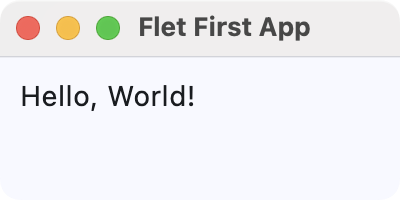 First Flet GUI application
You can run a Flet app as you'd run any Python app in the terminal. Additionally, Flet allows you to use the flet run command for live reload during development.
Exploring Flet Controls (Widgets)
Flet includes a wide variety of widgets, known as controls, in several categories. Some of these categories include the following:
In the following sections, you'll code simple examples showcasing a sample of each category's controls.
Buttons
Buttons are key components in any GUI application. Flet has several types of buttons that we can use in different situations, including the following:
FilledButton: A filled button without a shadow. Useful for important, final actions that complete a flow, like Save or Confirm.ElevatedButton: A filled tonal button with a shadow. Useful when you need visual separation from a patterned background.FloatingActionButton: A Material Design floating action button.
Here's an example that showcases these types of buttons:
import flet as ft

def main(page: ft.Page):
    page.title = "Flet Buttons Demo"
    page.window.width = 200
    page.window.height = 200

    page.add(ft.ElevatedButton("Elevated Button"))
    page.add(ft.FilledButton("Filled Button"))
    page.add(ft.FloatingActionButton(icon=ft.Icons.ADD))

ft.app(target=main)
Here, we call the add() method on our page object to add instances of ElevatedButton, FilledButton, and FloatingActionButton. Flet arranges these controls vertically by default.
Run it! You'll get a window that looks like the following.
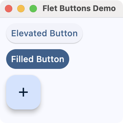 Flet buttons demo
Input and Selections
Input and selection controls enable users to enter data or select values in your app's GUI. Flet provides several commonly used controls in this category, including the following:
TextField: A common single-line or multi-line text entry control.Dropdown: A selection control that lets users pick a value from a list of options.Checkbox: A control for boolean input, often useful for preferences and agreement toggles.Radio: A selection radio button control commonly used inside aRadioGroupto choose a single option from a set.Slider: A control for selecting a numeric value along a track.Switch: A boolean on/off toggle.
Here's an example that showcases some of these input and selection controls:
import flet as ft

def main(page: ft.Page):
    page.title = "Flet Input and Selections Demo"
    page.window.width = 360
    page.window.height = 320

    name = ft.TextField(label="Name")
    agree = ft.Checkbox(label="I agree to the terms")
    level = ft.Slider(
        label="Experience level",
        min=0,
        max=10,
        divisions=10,
        value=5,
    )
    color = ft.Dropdown(
        label="Favorite color",
        options=[
            ft.dropdown.Option("Red"),
            ft.dropdown.Option("Green"),
            ft.dropdown.Option("Blue"),
        ],
    )
    framework = ft.RadioGroup(
        content=ft.Column(
            [
                ft.Radio(value="Flet", label="Flet"),
                ft.Radio(value="Tkinter", label="Tkinter"),
                ft.Radio(value="PyQt6", label="PyQt6"),
                ft.Radio(value="PySide6", label="PySide6"),
            ]
        )
    )
    notifications = ft.Switch(label="Enable notifications", value=True)

    page.add(
        ft.Text("Fill in the form and adjust the options:"),
        name,
        agree,
        level,
        color,
        framework,
        notifications,
    )

ft.app(target=main)
After setting the window's title and size, we create several input controls:
- A
TextFieldfor the user's name - A
Checkboxto agree to the terms - A
Sliderto select an experience level from 0 to 10 - A
Dropdownto pick a favorite color - A
RadioGroupwith several framework choices - A
Switchto enable or disable notifications, which defaults to ON
We add all these controls to the page using page.add(), preceded by a simple instruction text. Flet lays out the controls vertically (the default) in the order you pass them.
Run it! You'll see a simple form that uses text input, dropdowns, checkboxes, radio buttons, sliders, and switches.
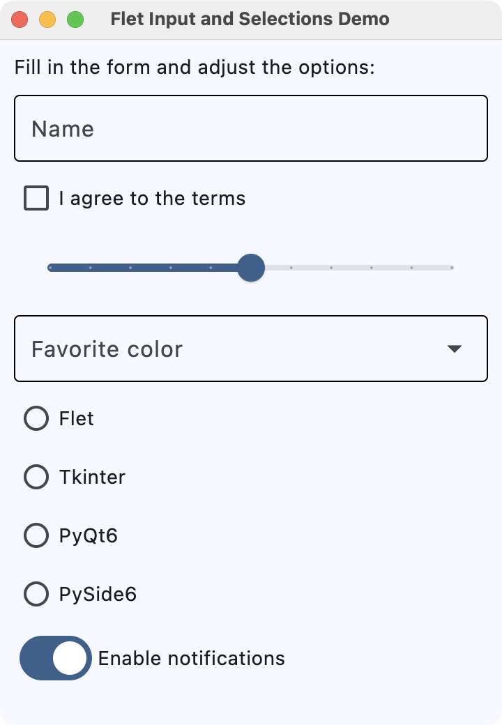 Flet input and selection controls demo
Navigation
Navigation controls allow users to move between different sections or views within an app. Flet provides several navigation controls, including the following:
NavigationBar: A bottom navigation bar with multiple destinations, which is useful for switching between three to five primary sections of your app.AppBar: A top app bar that can display a title, navigation icon, and action buttons.
Here's an example that uses NavigationBar to navigate between different views:
import flet as ft

def main(page: ft.Page):
    page.title = "Flet Navigation Bar Demo"
    page.window.width = 360
    page.window.height = 260

    info = ft.Text("You are on the Home tab")

    def on_nav_change(e):
        idx = page.navigation_bar.selected_index
        if idx == 0:
            info.value = "You are on the Home tab"
        elif idx == 1:
            info.value = "You are on the Search tab"
        else:
            info.value = "You are on the Profile tab"
        page.update()

    page.navigation_bar = ft.NavigationBar(
        selected_index=0,
        destinations=[
            ft.NavigationBarDestination(icon=ft.Icons.HOME, label="Home"),
            ft.NavigationBarDestination(icon=ft.Icons.SEARCH, label="Search"),
            ft.NavigationBarDestination(icon=ft.Icons.PERSON, label="Profile"),
        ],
        on_change=on_nav_change,
    )

    page.add(
        ft.Container(content=info, alignment=ft.alignment.center, padding=20),
    )

ft.app(target=main)
The NavigationBar has three tabs: Home, Search, and Profile, each with a representative icon that you provide using ft.Icons. Assigning this bar to page.navigation_bar tells Flet to display it as the app's bottom navigation component.
The behavior of the bar is controlled by the on_nav_change() callback (more on this in the section on events and callbacks). Whenever the user clicks a tab, Flet calls on_nav_change(), which updates the text with the appropriate message.
Run it! Click the different tabs to see the text on the page update as you navigate between sections.
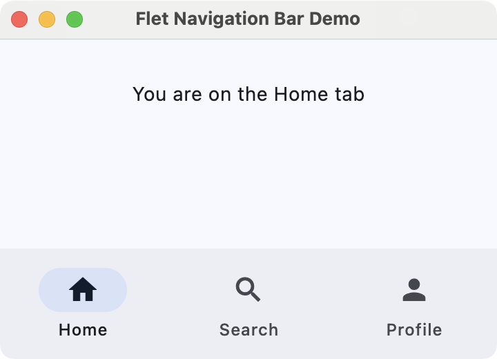 Flet navigation bar demo
Information Displays
We can use information-display controls to present content to the user, such as text, images, and rich list items. These controls help communicate status, context, and details without requiring user input.
Some common information-display controls include the following:
Text: The basic control for showing labels, paragraphs, and other readable text.Image: A control for displaying images from files, assets, or URLs.
Here's an example that combines these controls:
import flet as ft

def main(page: ft.Page):
    page.title = "Flet Information Displays Demo"
    page.window.width = 340
    page.window.height = 400

    header = ft.Text("Latest image", size=18)

    hero = ft.Image(
        src="https://picsum.photos/320/320",
        width=320,
        height=320,
        fit=ft.ImageFit.COVER,
    )

    page.add(
        header,
        hero,
    )

ft.app(target=main)
In main(), we create a Text widget called header to show "Latest image" with a larger font size. The hero variable is an Image control that loads an image from the URL https://picsum.photos/320/320.
We use a fixed width and height together with ImageFit.COVER so that the image fills its box while preserving aspect ratio and cropping if needed.
Run it! You'll see some text and a random image from Picsum.photos.
 Flet information display demo
Dialogs, Alerts, and Panels
Dialogs, alerts, and panels enable you to draw attention to important information or reveal additional details without leaving the current screen. They are useful for confirmations, warnings, and expandable content.
Some useful controls in this category are listed below:
AlertDialog: A modal dialog that asks the user to acknowledge information or make a decision.Banner: A prominent message bar displayed at the top of the page for important, non-modal information.DatePicker: A control that lets the user pick a calendar date in a pop-up dialog.TimePicker: A control for selecting a time of day from a dialog-style picker.
Here's an example that shows an alert dialog to ask for exit confirmation:
import flet as ft

def main(page: ft.Page):
    page.title = "Flet Dialog Demo"
    page.window.width = 300
    page.window.height = 300

    def on_dlg_button_click(e):
        if e.control.text == "Yes":
            page.window.close()
        page.close(dlg_modal)

    dlg_modal = ft.AlertDialog(
        modal=True,
        title=ft.Text("Confirmation"),
        content=ft.Text("Do you want to exit?"),
        actions=[
            ft.TextButton("Yes", on_click=on_dlg_button_click),
            ft.TextButton("No", on_click=on_dlg_button_click),
        ],
        actions_alignment=ft.MainAxisAlignment.END,
    )

    page.add(
        ft.ElevatedButton(
            "Exit",
            on_click=lambda e: page.open(dlg_modal),
        ),
    )

ft.app(target=main)
In this example, we first create an AlertDialog with a title, some content text, and two action buttons labeled Yes and No.
The on_dlg_button_click() callback checks which button was clicked and closes the application window if the user selects Yes. The page shows a single Exit button that opens the dialog. After the user responds, the dialog is closed.
Run it! Try clicking the button to open the dialog. You'll see a window similar to the one shown below.
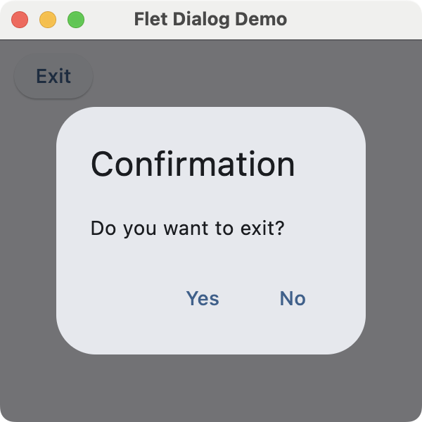 Flet dialog demo
Laying Out the GUI With Flet
Controls in this category are often described as container controls that can hold child controls. These controls enable you to arrange widgets on an app's GUI to create a well-organized and functional interface.
Flet has many container controls. Here are some of them:
Page: This control is the root of the control hierarchy or tree. It is also listed as an adaptive container control.Column: A container control used to arrange child controls in a column.Row: A container control used to arrange child controls horizontally in a row.Container: A container control that allows you to modify its size (e.g.,height) and appearance.Stack: A container control where properties likebottom,left,right, andtopallow you to place children in specific positions.Card: A container control with slightly rounded corners and an elevation shadow.
By default, Flet stacks widgets vertically using the Column container. Here's an example that demonstrates basic layout options in Flet:
import flet as ft

def main(page: ft.Page):
    page.title = "Flet Layouts Demo"
    page.window.width = 250
    page.window.height = 300

    main_layout = ft.Column(
        [
            ft.Text("1) Vertical layout:"),
            ft.ElevatedButton("Top"),
            ft.ElevatedButton("Middle"),
            ft.ElevatedButton("Bottom"),
            ft.Container(height=12),  # Spacer

            ft.Text("2) Horizontal layout:"),
            ft.Row(
                [
                    ft.ElevatedButton("Left"),
                    ft.ElevatedButton("Center"),
                    ft.ElevatedButton("Right"),
                ]
            ),
        ],
    )

    page.add(main_layout)

ft.app(target=main)
In this example, we use a Column object as the app's main layout. This layout stacks text labels and buttons vertically, while the inner Row object arranges three buttons horizontally. The Container object with a fixed height acts as a spacer between the vertical and horizontal sections.
Run it! You'll get a window like the one shown below.
 Flet layouts demo
Handling Events With Callbacks
Flet uses event handlers to manage user interactions and perform actions. Most controls accept an on_* argument, such as on_click or on_change, which you can set to a Python function or other callable that will be invoked when an event occurs on the target widget.
The example below provides a text input and a button. When you click the button, it opens a dialog displaying the input text:
import flet as ft

def main(page: ft.Page):
    page.title = "Flet Event & Callback Demo"
    page.window.width = 340
    page.window.height = 360

    def on_click(e):  # Event handler or callback function
        dialog_text.value = f'You typed: "{txt_input.value}"'
        page.open(dialog)
        page.update()

    txt_input = ft.TextField(label="Type something and press Click Me!")
    btn = ft.ElevatedButton("Click Me!", on_click=on_click)
    dialog_text = ft.Text("")
    dialog = ft.AlertDialog(
        modal=True,
        title=ft.Text("Dialog"),
        content=dialog_text,
        actions=[ft.TextButton("OK", on_click=lambda e: page.close(dialog))],
        open=False,
    )

    page.add(
        txt_input,
        btn,
    )

ft.app(target=main)
When you click the button, the on_click() handler or callback function is automatically called. It sets the dialog's text and opens the dialog. The dialog has an OK button that closes it by calling page.close(dialog).
Run it! You'll get a window like the one shown below.
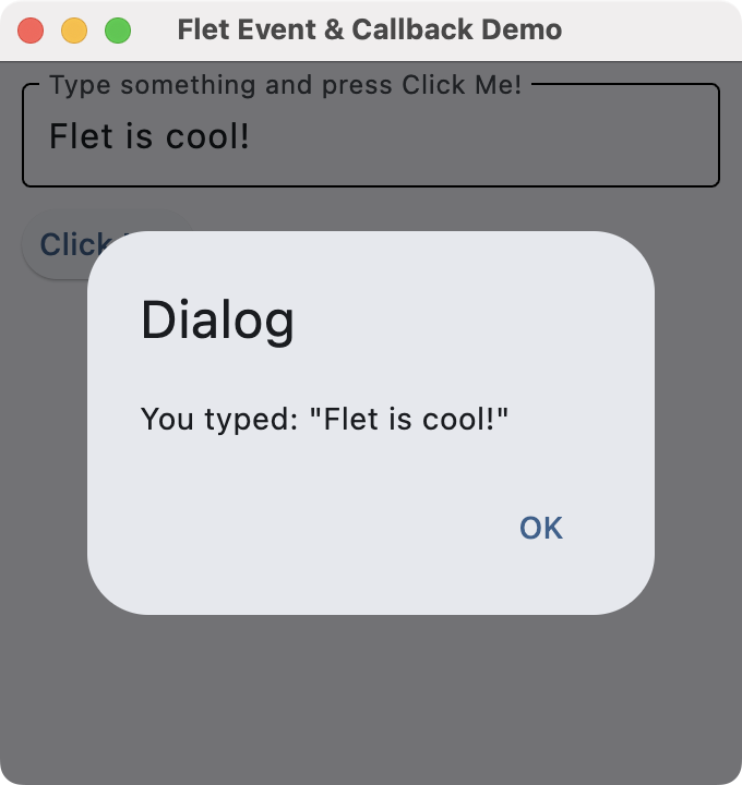 Flet callbacks
To see this app in action, type some text into the input and click the Click Me! button.
Conclusion
Flet offers a powerful and modern toolkit for developing GUI applications in Python. It allows you to create desktop and web GUIs from a single codebase. In this tutorial, you've learned the basics of using Flet for desktop apps, including controls, layouts, and event handling.
Try building your first Flet web app and experimenting with widgets, callbacks, layouts, and more!

Create GUI Applications with Python & Qt6 by Martin Fitzpatrick
(PySide6 Edition) The hands-on guide to making apps with Python — Over 15,000 copies sold!