The QCheckBox widget is a square-shaped toggle used in Python GUI applications to let users
enable or disable options, such as application settings or feature preferences.
Checkboxes usually have an adjacent label indicating what the checkbox represents.
Checkboxes are usually used to represent boolean state, being either checked (on) or unchecked (off).
However, you can also have tri-state checkboxes with a third indeterminate state. In this tutorial,
you'll learn how to create and customize checkboxes in your own PyQt and PySide applications, using the QCheckBox
class.
Creating Checkbox Widgets With QCheckBox
The QCheckBox class represents a checkbox widget.
A checkbox is an option widget that can be switched on (checked) or off (unchecked) by the user.
This widget is common in settings or preferences dialogs
where the user fine-tunes an application's configuration.
Checkboxes typically have a square shape looking like a checkbox on a paper form. We can click the box to switch it on and click it again to switch it off. When checked a cross or checkmark symbol will appear in the box. When a checkbox is unchecked, it will appear as an empty square.
If you're using PyQt or PySide to create GUI applications in Python, then you can add checkboxes to your application with the QCheckBox class. This class provides two different constructors that we can use to create checkboxes:
| Constructor | Description |
|---|---|
QCheckBox(parent: QWidget = None) |
Constructs a checkbox with an optional parent widget but without an associated text |
QCheckBox(text: str, parent: QWidget = None) |
Constructs a checkbox with an associated description text and an optional parent widget |
To illustrate how to use the above constructors, let's get into our first example:
- PyQt6
- PySide6
import sys

from PyQt6.QtWidgets import (
    QApplication,
    QCheckBox,
    QVBoxLayout,
    QWidget,
)

class Window(QWidget):
    def __init__(self, parent=None):
        super().__init__(parent)
        # Checkbox with no label
        noTextCkBox = QCheckBox()
        # Checkbox with a text label
        textCkBox = QCheckBox(text="Option")
        layout = QVBoxLayout()
        layout.addWidget(noTextCkBox)
        layout.addWidget(textCkBox)
        self.setLayout(layout)

if __name__ == "__main__":
    app = QApplication(sys.argv)
    window = Window()
    window.show()
    sys.exit(app.exec())
import sys

from PySide6.QtWidgets import (
    QApplication,
    QCheckBox,
    QVBoxLayout,
    QWidget,
)

class Window(QWidget):
    def __init__(self, parent=None):
        super().__init__(parent)
        # Checkbox with no label
        noTextCkBox = QCheckBox()
        # Checkbox with a text label
        textCkBox = QCheckBox(text="Option")
        layout = QVBoxLayout()
        layout.addWidget(noTextCkBox)
        layout.addWidget(textCkBox)
        self.setLayout(layout)

if __name__ == "__main__":
    app = QApplication(sys.argv)
    window = Window()
    window.show()
    sys.exit(app.exec())
In this example, we import QCheckBox from the QtWidgets module. We create two QCheckBox instances
in the __init__ method of the Window class. The first is created using the constructor that does not require a text label.
Both constructors take an optional parent widget, but since we are adding the checkbox widgets to a layout,
we don't need to pass a parent when contructing them.
Next up, we use the second constructor of QCheckBox to create another checkbox, this time with descriptive label.
The text will display on the right of the checkbox. The text is a regular Python string. This label would
typically be used to describe the option to be enabled or disabled, but here is just "Option".
Create GUI Applications with Python & Qt6 by Martin Fitzpatrick — (PySide6 Edition) The hands-on guide to making apps with Python — Save time and build better with this book. Over 15K copies sold.
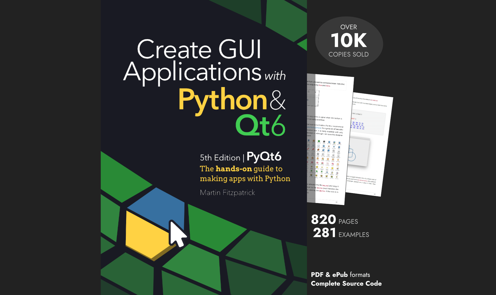
Save this code to a .py file and run it. You'll get a window that looks something like this:
As expected, the first checkbox has no associated text. It's just a square box on the window. This isn't too helpful, because it doesn't provide any information to your users. However, it can be useful when creating an array of checkboxes laid out to present some data in a table or a list.
The second checkbox on the window looks more familiar -- it has an associated text.
Both checkboxes are fully functional. We can check and uncheck them by clicking on them or -- in the case of the second example -- on the label. However, the checkboxes don't do any action yet, they just change their internal state from checked to unchecked and the other way around. To give a checkbox purpose we need to check the state and take action accordingly ourselves.
In most UIs checkboxes typically don't trigger external actions when toggled. Use buttons to launch or trigger things.
Normal checkboxes have two internal states Checked and Unchecked, while tri-state checkboxes add a third
PartiallyChecked state. Next we'll look at how to check and set these states on both two-state and tri-state checkboxes.
Getting and Setting the QCheckBox State
The most important property of a QCheckBox is its internal state. This holds whether the checkbox is checked or not. By checking this property, you can take appropriate action in your application.
There are two main methods for checking the checkbox internal state -- isChecked() and checkState(). The possible values
returned for a two-state checkbox are shown below:
| Methods | Behavior |
|---|---|
isChecked() |
Will return True if checkbox is checked, False if it is unchecked. |
checkState() |
In two-state checkboxes this will return either Checked and Unchecked. |
Consider the following example:
- PyQt6
- PySide6
import sys

from PyQt6.QtWidgets import (
    QApplication,
    QCheckBox,
    QVBoxLayout,
    QWidget,
)

class Window(QWidget):
    def __init__(self, parent=None):
        super().__init__(parent)
        self.checkBox = QCheckBox(text="Unchecked")
        layout = QVBoxLayout()
        layout.addWidget(self.checkBox)
        self.setLayout(layout)
        self.checkBox.stateChanged.connect(self.onStateChanged)

    def onStateChanged(self):
        if self.checkBox.isChecked():
            self.checkBox.setText("Checked")
        else:
            self.checkBox.setText("Unchecked")

if __name__ == "__main__":
    app = QApplication(sys.argv)
    window = Window()
    window.show()
    sys.exit(app.exec())
import sys

from PySide6.QtWidgets import (
    QApplication,
    QCheckBox,
    QVBoxLayout,
    QWidget,
)

class Window(QWidget):
    def __init__(self, parent=None):
        super().__init__(parent)
        self.checkBox = QCheckBox(text="Unchecked")
        layout = QVBoxLayout()
        layout.addWidget(self.checkBox)
        self.setLayout(layout)
        self.checkBox.stateChanged.connect(self.onStateChanged)

    def onStateChanged(self):
        if self.checkBox.isChecked():
            self.checkBox.setText("Checked")
        else:
            self.checkBox.setText("Unchecked")

if __name__ == "__main__":
    app = QApplication(sys.argv)
    window = Window()
    window.show()
    sys.exit(app.exec())
In this example, we first create a QCheckBox instance with the text "Click me!" on it. In this case,
we're defining a two-state checkbox, which represents the default behavior of this widget.
Then we create the app's layout and add the checkbox. Finally, we connect the stateChanged() signal
with the onStateChanged() slot or method. This signal is emitted whenever we click the checkbox,
and the onStateChanged() method is automatically called.
You can use the stateChanged() signal to trigger something to happen each time the checkbox changes its state.
To connect the stateChanged() signal to a slot, you use the standard syntax:
checkbox.<signal>.connect(<method>)
In this construct, checkbox is the QCheckBox object we need to connect to a
given slot. The <signal> name is stateChanged. Finally, <method> represents the target slot or method we want to connect the signal.
The onStateChanged() method uses isChecked() to determine the current state of our checkbox.
This method returns True if the checkbox is checked and False if it's unchecked. The checkbox
text changes alternatively from Checked to Unchecked depending on the result of this condition:
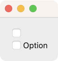
Whenever you click the checkbox on this window, the text changes from Checked to Unchecked alternatively.
It's usually not a good idea to change a checkbox label with the state as it's confusing. Does the "Unchecked" label next to a unchecked checkbox mean checked or unchecked?
We could have used checkState() to determine the current state of our checkbox in the above example.
However, using isChecked() feels more natural when working with two-state checkboxes.
When we are working with tri-state checkboxes, checkState() is our only option. We'll see how to
work with checkState() in the next section.
Building and Working With Tri-State Checkboxes
In addition to regular two-state checkboxes, you can optionally create tri-state checkboxes with QCheckBox.
This type of checkbox comes in handy when we want to give our user the option to set the
checkbox in an intermediate state known as a partially checked state. This state means
that the checkbox is neither checked nor unchecked.
Tri-state checkboxes are typically used to represent groups of other checkboxes, allowing them to all be turned on or off in one go. The partially checked state then indicates that some of the children are on and some are off.
When using tri-state checkboxes, the isChecked() and checkState() methods return the following values --
| Methods | Behavior |
|---|---|
isChecked() |
Will return True if checkbox is checked or partially checked, False if it is unchecked. |
checkState() |
In three-state checkboxes this will return either Checked, Unchecked or PartiallyChecked . |
The QCheckBox class has a Boolean tristate property
that indicates whether the checkbox is tri-state. This property defaults to False. If we set
it to True, we turn our checkbox into a tri-state checkbox. To change the value
of tristate, you need to use the setTristate() with a boolean value as an argument.
You can also turn a checkbox tri-state by setting a partially checked state on it, using .setState(Qt.CheckState.PartiallyChecked).
Consider the following example:
- PyQt6
- PySide6
import sys

from PyQt6.QtCore import Qt
from PyQt6.QtWidgets import (
    QApplication,
    QCheckBox,
    QVBoxLayout,
    QWidget,
)

class Window(QWidget):
    def __init__(self, parent=None):
        super().__init__(parent)
        self.triStateCheckBox = QCheckBox(text="Unchecked")
        self.triStateCheckBox.setTristate(True)
        layout = QVBoxLayout()
        layout.addWidget(self.triStateCheckBox)
        self.setLayout(layout)
        self.triStateCheckBox.stateChanged.connect(self.onStateChanged)

    def onStateChanged(self):
        state = self.triStateCheckBox.checkState()
        if state == Qt.CheckState.Checked:
            self.triStateCheckBox.setText("Checked")
        elif state == Qt.CheckState.PartiallyChecked:
            self.triStateCheckBox.setText("Partially checked")
        else:
            self.triStateCheckBox.setText("Unchecked")

if __name__ == "__main__":
    app = QApplication(sys.argv)
    window = Window()
    window.show()
    sys.exit(app.exec())
import sys

from PySide6.QtCore import Qt
from PySide6.QtWidgets import (
    QApplication,
    QCheckBox,
    QVBoxLayout,
    QWidget,
)

class Window(QWidget):
    def __init__(self, parent=None):
        super().__init__(parent)
        self.triStateCheckBox = QCheckBox(text="Unchecked")
        self.triStateCheckBox.setTristate(True)
        layout = QVBoxLayout()
        layout.addWidget(self.triStateCheckBox)
        self.setLayout(layout)
        self.triStateCheckBox.stateChanged.connect(self.onStateChanged)

    def onStateChanged(self):
        state = self.triStateCheckBox.checkState()
        if state == Qt.CheckState.Checked:
            self.triStateCheckBox.setText("Checked")
        elif state == Qt.CheckState.PartiallyChecked:
            self.triStateCheckBox.setText("Partially checked")
        else:
            self.triStateCheckBox.setText("Unchecked")

if __name__ == "__main__":
    app = QApplication(sys.argv)
    window = Window()
    window.show()
    sys.exit(app.exec())
In this example, we create a regular checkbox using the QCheckBox() constructor. To set this
checkbox as tri-state, you call .setTristate() with True as an argument. From now on, our
checkbox will have three states represented by the following values:
| Constant | Value | Description |
|---|---|---|
Qt.CheckState.Unchecked |
0 |
The checkbox is unchecked. |
Qt.CheckState.PartiallyChecked |
1 |
The checkbox is partially checked. |
Qt.CheckState.Checked |
2 |
The checkbox is checked. |
In tri-state checkboxes, the isChecked() method will return True whether the checkbox
is checked or partially checked, and False if it is unchecked.
If you want to distinguish between checked and partially checked states, you need to use
checkState() directly. Calling checkState() returns one of the constants in the above table, representing the current state of the checkbox.
Our onStateChanged() method is connected to the stateChanged signal of the checkbox.
In this method, we get the current state by calling checkState() on the checkbox and storing the result in the variable state.
We then check the value of this variable against the different states and take action accordingly. In this example,
we alternatively change the checkbox text to reflect its state.
Here's how this example works in practice:
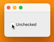
When you click the checkbox, its text changes from Unchecked to Partially checked and finally to Checked. These are the three possible states of this kind of checkbox.
While we used the checkState() method above, the stateChanged signal actually sends the
current state, as an integer value, to the slot. We can map that into the correct state
in the method directly by passing it to Qt.CheckState. For example.
    def onStateChanged(self, state):
        state = Qt.CheckState(state)
        if state == Qt.CheckState.Checked:
            self.triStateCheckBox.setText("Checked")
        elif state == Qt.CheckState.PartiallyChecked:
            self.triStateCheckBox.setText("Partially checked")
        else:
            self.triStateCheckBox.setText("Unchecked")
In this alternative implementation of onStateChanged(), we receive a state argument that we map to a Qt.CheckState object. The rest of the code remains the same.
The mapping step is only required in PyQt6. In both PyQt5, PySide2, and PySide6 this is done automatically.
It's up to you which implementation to use in your code.
Using QCheckBox Widgets in a Settings Dialog
We can use QCheckBox widgets to provide a clean and user-friendly way to enable or
disable options in a Python GUI app. Checkboxes are especially useful when building preferences or
settings dialogs where the users can customize application behavior. For example, say that you're making a text editor
and you want to allow the user to customize a few features like:
- Show word count
- Auto pair brackets
- Show minimap
Checkbox options shouldn't usually be mutually exclusive. If you have mutually exclusive options, consider
using the QRadioButton class instead.
In this case, you can use a checkbox for each of these options like in the following code:
- PyQt6
- PySide6
import sys

from PyQt6.QtWidgets import (
    QApplication,
    QCheckBox,
    QLabel,
    QVBoxLayout,
    QWidget,
)

class Window(QWidget):
    def __init__(self, parent=None):
        super().__init__(parent)
        self.wordCountCkBox = QCheckBox(text="Show word count", parent=self)
        self.bracketsCkBox = QCheckBox(text="Auto pair brackets", parent=self)
        self.minimapCkBox = QCheckBox(text="Show minimap", parent=self)
        self.selectionLabel = QLabel(text="No selection yet", parent=self)
        layout = QVBoxLayout()
        layout.addWidget(self.wordCountCkBox)
        layout.addWidget(self.bracketsCkBox)
        layout.addWidget(self.minimapCkBox)
        layout.addWidget(self.selectionLabel)
        self.setLayout(layout)
        self.wordCountCkBox.stateChanged.connect(self.onStateChanged)
        self.bracketsCkBox.stateChanged.connect(self.onStateChanged)
        self.minimapCkBox.stateChanged.connect(self.onStateChanged)

    def onStateChanged(self):
        selection = "You've selected:\n"
        if self.wordCountCkBox.isChecked():
            selection += "- Word count\n"
        if self.bracketsCkBox.isChecked():
            selection += "- Auto pair brackets\n"
        if self.minimapCkBox.isChecked():
            selection += "- Show minimap\n"
        self.selectionLabel.setText(selection)

if __name__ == "__main__":
    app = QApplication(sys.argv)
    window = Window()
    window.show()
    sys.exit(app.exec())
import sys

from PySide6.QtWidgets import (
    QApplication,
    QCheckBox,
    QLabel,
    QVBoxLayout,
    QWidget,
)

class Window(QWidget):
    def __init__(self, parent=None):
        super().__init__(parent)
        self.wordCountCkBox = QCheckBox(text="Show word count", parent=self)
        self.bracketsCkBox = QCheckBox(text="Auto pair brackets", parent=self)
        self.minimapCkBox = QCheckBox(text="Show minimap", parent=self)
        self.selectionLabel = QLabel(text="No selection yet", parent=self)
        layout = QVBoxLayout()
        layout.addWidget(self.wordCountCkBox)
        layout.addWidget(self.bracketsCkBox)
        layout.addWidget(self.minimapCkBox)
        layout.addWidget(self.selectionLabel)
        self.setLayout(layout)
        self.wordCountCkBox.stateChanged.connect(self.onStateChanged)
        self.bracketsCkBox.stateChanged.connect(self.onStateChanged)
        self.minimapCkBox.stateChanged.connect(self.onStateChanged)

    def onStateChanged(self):
        selection = "You've selected:\n"
        if self.wordCountCkBox.isChecked():
            selection += "- Word count\n"
        if self.bracketsCkBox.isChecked():
            selection += "- Auto pair brackets\n"
        if self.minimapCkBox.isChecked():
            selection += "- Show minimap\n"
        self.selectionLabel.setText(selection)

if __name__ == "__main__":
    app = QApplication(sys.argv)
    window = Window()
    window.show()
    sys.exit(app.exec())
In this example, we create three checkboxes, one per option. We also create a label object to show the user's selections. If you run this application, then you'll get the following behavior:
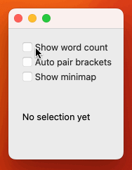
This dialog shows the three required options for your text editor. Of course, this dialog doesn't look like a fully functional settings or preferences dialog. It intends to show how you can use checkboxes to provide non-exclusive options to your users. Note that you can select any combination of options.
Setting Text and Icon Properties on QCheckBox
Up to this point, we've learned how to create two-state and tri-state checkboxes in your Python GUI
applications. We've also learned how to make our checkboxes perform actions in response to
state changes by connecting the stateChanged signals with concrete methods known as slots.
In this section, we'll learn about other useful features of QCheckBox, including
the text and icon properties shown below:
| Property | Description | Getter Method | Setter Method |
|---|---|---|---|
text |
Holds the text shown on the button | text() |
setText() |
icon |
Holds the icon shown on the button | icon() |
setIcon() |
As its name suggests, the text property controls the current text associated with a
checkbox. You can use the setText() method to change this property and text() to
retrieve its current value if needed. In previous sections, you used setText() to
change the text of a checkbox. So, let's focus on how to work with icons.
Here's an example of a checkbox representing a traffic light in which each state will have its own associated icon:
- PyQt6
- PySide6
import sys

from PyQt6.QtCore import Qt
from PyQt6.QtGui import QIcon
from PyQt6.QtWidgets import QApplication, QCheckBox, QVBoxLayout, QWidget

class Window(QWidget):
    def __init__(self, parent=None):
        super().__init__(parent)
        self.lightCkBox = QCheckBox(parent=self)
        self.lightCkBox.setTristate(True)
        self.lightCkBox.setIcon(QIcon("icons/red.png"))
        layout = QVBoxLayout()
        layout.addWidget(self.lightCkBox)
        self.setLayout(layout)
        self.lightCkBox.stateChanged.connect(self.onStateChanged)

    def onStateChanged(self, state):
        state = Qt.CheckState(state)
        if state == Qt.CheckState.Checked:
            self.lightCkBox.setIcon(QIcon("icons/green.png"))
        elif state == Qt.CheckState.PartiallyChecked:
            self.lightCkBox.setIcon(QIcon("icons/yellow.png"))
        else:
            self.lightCkBox.setIcon(QIcon("icons/red.png"))

if __name__ == "__main__":
    app = QApplication(sys.argv)
    window = Window()
    window.show()
    sys.exit(app.exec())
import sys

from PySide6.QtCore import Qt
from PySide6.QtGui import QIcon
from PySide6.QtWidgets import QApplication, QCheckBox, QVBoxLayout, QWidget

class Window(QWidget):
    def __init__(self, parent=None):
        super().__init__(parent)
        self.lightCkBox = QCheckBox(parent=self)
        self.lightCkBox.setTristate(True)
        self.lightCkBox.setIcon(QIcon("icons/red.png"))
        layout = QVBoxLayout()
        layout.addWidget(self.lightCkBox)
        self.setLayout(layout)
        self.lightCkBox.stateChanged.connect(self.onStateChanged)

    def onStateChanged(self, state):
        state = Qt.CheckState(state)
        if state == Qt.CheckState.Checked:
            self.lightCkBox.setIcon(QIcon("icons/green.png"))
        elif state == Qt.CheckState.PartiallyChecked:
            self.lightCkBox.setIcon(QIcon("icons/yellow.png"))
        else:
            self.lightCkBox.setIcon(QIcon("icons/red.png"))

if __name__ == "__main__":
    app = QApplication(sys.argv)
    window = Window()
    window.show()
    sys.exit(app.exec())
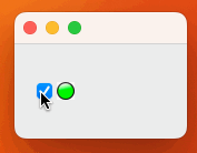
In this example, we use the setIcon() method to change the icon associated with the
checkbox according to its current state. Go ahead and run the app! You'll get a window like the following:
In this example, the red light is associated with the unchecked state, the yellow light is linked to the partially checked state, and the green light is associated with the checked state.
Using icons like in this example is something rare with checkbox widgets. You'll typically use descriptive text. But it's good to know the capability is there for when you need it.
Conclusion
Checkboxes are essential widgets in any Python GUI application. They allow us to give our users a clean way to enable or disable options in our applications. They are commonly used in dialogs and preferences windows to allow enabling and disabling of application features or configuring behavior.
In this tutorial, you've learned how to create, use, and customize QCheckBox widgets while
building Python GUI applications with PyQt and PySide. You now know how to work with two-state and tri-state checkboxes, connect stateChanged signals to slots, and use icons and text properties to build dynamic, user-friendly interfaces.